Sunday 27 September 2015

More Faces

Now that I have found a great way that works perfectly for me when it comes to doing portraits I can't stop (not sure though if you can really say something like that after two portraits...lol).

So here she comes:


I have again first roughly sketched the shades with a soft brush and walnut ink solution before I went in with a brown colour pencil and then finished it with a dark brown brush tip Faber Castell PITT artist pen.

I have taken steps images to show the process.


First positioning of the shady areas, lips and eyes. 


 Drawing with the brown colour pencil.


Shading in the hair.


Adding some walnut ink stains and doing some small corrections with white Gesso.

If you haven't seen Kim Dellow's fab "Show Your Face" community where everyone is free to join in and get inspired and/or share his own painted, drawn,...mixed media faces, I highly recommend you check it out. 

http://www.kimdellow.co.uk/2015/09/show-your-face_25.html

It is really fascinating seeing all the different inspired approaches to portraying!

Hugs and happy crafting,
Claudia xxx

Wednesday 23 September 2015

He/She is a ...


We all are several "persons".
I am a mother, then a wife, an artist, a friend, a sister, an aunt, a daugther...not always in the same order.

And there are days for example when I would like to be more of an adventurer than having to do my household stuff or walk the dog along the same old paths. Sometimes this feeling from inside breaks through and I end up for example  having bought a piece of clothing I thought was perfect for feeling and showing my inner adventurer's nature....not daring to wear it, because the feeling from that day has gone.

Do photographs show what we really "are"? And are we aware that we see more than a one-dimensional person when we look at photographs? I'm not so sure. And my series of four altered playing cards is an attempt to make the beholder think about the persons he sees...

 I used Distress stains and Distress marker ("ground espresso"), designer papers, ephemera, washi tape, used and dried tea bags, DecoArt Decou-Page,  DecoArt media black modelling paste and stencils and word stickers for my four cards. For a larger view click on the images.


Thanks for stopping by!

Hugs and happy crafting,
Claudia 
xxx

Thursday 17 September 2015

She Who Doesn't Smile

Today I finally jumped the hurdle and took up doing portraits again. I hadn't done portraits and faces in general for ages...maybe because I never really could decide on what to do to finish them up satisfyingly. Now that I have been exploring mixed media and other "non-academic" media and techniques I thought that I might succeed this time...


And I knew that I had to trick myself so I wouldn't erase and correct my "mistakes" all the time (and until I had erased a hole in my heavy artists paper). So I forced myself to "draw" the first rough (and quick) sketch with a soft brush and walnut ink and focus on the shades first instead of trying to get all the proportions and parts of the face in the right places and shapes. And that worked just brilliantly!!!

I took some steps images so you can see how I approached the portrait:

 Step 1
I quickly painted shapes and layers and did some rough shading
using a soft brush and the diluted ink


Step 2
For details I went in with a dark brown wax crayon


finished sketch


Next I sprayed on two coats of heavily diluted DecoArt media Matte Medium to seal my sketch so the ink and crayon would not react with the water and wet paints.


Then I made a copy of the sketch to use as a mask in the steps to follow. 


 I covered the face with my selfmade mask and stamped on some Chinese text and other patterns in various spots using black archival stamping ink. Then I applied DecoArt media white Modelling Paste using various stencils and a palette knife.


I let the modelling paste dry naturally (using a heat tool can cause bubbling). In the meantime I cut a lot of small circles from old book and magazine pages. I cut them by hand so the shapes were irregular and therefore not perfect circles as perfect circles quickly get too dominant in a painting and look too artificial (which doesn't go well with handpainted projects).

The cut out circles were then glued onto my sketched portrait using DecoArt media Matte Medium.


In a later step I painted them and outlined them roughly, seeing to it that I ended up with various shades of natural whites, browns and orange. Some were painted with DecoArt media Translucent White, which makes toning in collaged on elements really easy. The dark brown colour between the circles was painted in using Raw Umber DecoArt media fluid acrylic and a fine tip brush.


I added some doodling with a white Sharpie, dots of acrylic paint, DecoArt media Metallic Gold paint and smudged outlines with a watersoluble black pencil and a wet brush here and there.


The stencilled on texture was first given a wash with diluted DecoArt media Raw Umber fluid acrylic and once that had dried I rubbed on some DecoArt "Brilliant Turquoise" Metallic Lustre. I also painted some of the glued on circles and shapes with the Metallic Lustre (using a soft brush and little water).


I added washes and scraped on layers of DecoArt media fluid acrylics Diarylide Yellow, Burnt Siena, Transparent Yellow Iron Oxide, Quinacridone Burnt Orange, Titan Buff and Raw Umber alongside some scraped on black and white DecoArt media Gesso.


Using the palette knife to scrape on and layer paints creates a lot of depth and texture.


I finished up my painting by highlighting the eyes (with white paint and a black brush tip china ink pen) and adding some white, red and black doodling to some of the collaged on circles.


And here she is:


I hope you like her as much as I do!

And I just discovered that I am well in time to join in the lovely and utterly inspiring community of "Show Your Face" - hosted by the wonderful Kim Dellow!

To find out more about it and this weeks link up collection, click HERE.


Hugs and happy crafting,
Claudia 
xxx


Tuesday 15 September 2015

"Tag It!" - the September Challenge at SASPC

 Hi and servus, dear visitors!
Time to share with you my project for the mid-month reminder over at SanDee&amelie's Steampunk Challenges. This month we thought something quick like a tag might be a great opportunity to get back into the crafting saddle after the summer break - so show us your TAGS - either steampunk, industrial or vintage ones!

Do tags or not do tags - that is my question at the moment.
When I began discovering crafty blogland three years ago with all the fantastic rubber stamp collections and other crafty goodness out there, I started with ATCs and quickly moved on to tags as they offered a slightly larger format - which was perfect for trying out all those techniques that were new and fascinating to me. And then - after some time and practice - that somehow didn't do the job for me anymore...mixed media used on altered art, canvasses, in journals, on paintboard...they suddenly seemed to make more "sense". It was as if I felt that tags weren't good enough anymore...if you know what I mean.

But after a long break from doing tags I just found that they are perfect for starting over after a long mojo-less period. They don't put that pressure on you that canvasses or art journals do. You just play around - and if you like the result you can still use whatever you have tried and discovered on your tag for a larger project if you like. And if you don't,  you still did some "art-y exercising". Right?

Erm....what was this post originally about?....well, the steampunk challenge over at SASPC...yesssss.

I recently bought some awesome stamps from Carabelle Studio and wanted to use one of them on my tag for our challenge. They offer some fantastic steampunk designs and instead of just using rubber stamping for adding texture and depth to my project I wanted to make the stamped image the focal point this time. As I am not the colouring type of crafter I mainly use stamping as an addition. Not this time!


First I remembered one of my favourite Tim Holtz background techniques using Distress Inks, water and the heat gun - and really enjoyed doing it again! I used rusty hinge, walnut stain and peeled paint alongside a solution made from Walnut Ink Crystals (from Tsukineko). These are crystals you mix with hot water to get a lovely brown you can use for dyeing fabric or paper...or shading around stamped images and adding splashes with a soft brush (like I did).


Painting the walnut ink solution around my image still let the other stains and colours show through and helped highlight the stamped area.

I also wanted to use some of the blisters I have been hoarding for ages...you know: those transparent plastic packages all the yummy embellishments come in. I thought I could use them as capsules for some watch parts that would move when moving the tag around.


As there were many circles (from the gears on the stamped image) I decided to make them the main shape on my tag and added some other circular elements: brads and Tim Holtz enforcement ring stickers. I shaded them in with a black watersoluble pencil and a fine tip brush loaded with water.


I felt that my tag lacked some "metal bling", so I painted some circles around some of my elements with DecoArt media Metallic Gold acrylic paint. For a finishing touch I also added some detail with a white Sharpie and a white watersoluble pencil.


I really enjoyed playing around with the blister "capsule" and my paints, pens and inks!


The face of the steampunk gentleman was painted over with DecoArt media Translucent White and then shaded with a brown pencil.


I hope that some of the fun I had has become visible on the tag too!


I would like to thank you for stopping by and also invite you to hop over to SanDee&amelie's Steampunk Challenges to check out the beautiful tags of my team mates! And maybe I will soon see your lovely tags entered to our challenge! Yay! I always love to see how others approach the same challenge - and it always provides me with a lot of awesome inspiration for my own work! So thanks to all for playing along and sharing their wonderful art!

Hugs and happy crafting,
Claudia x 


Sunday 6 September 2015

Have a Frightfully Spooky Halloween! - a DecoArt Mixed Media Halloween Tutorial

Servus and welcome to my first Halloween project (including a detailed mixed media tutorial) for this year!

This project was mainly created for the first and fab Mixed Media Halloween "Haunts" challenge hosted by DecoArt Mixed Media, featuring a lot of awesome projects by the DT and offering two huge prize packages for two winners who will be chosen from all the entries by Mr. Skinner himself! So don't miss it!

http://www.decoart.com/mixedmediablog/article/135/mixed_media_haunts_challenge


So for today I want to show you how to do some layering with some of my all time favourite Halloween die cuts and use them alongside some of the DecoArt media products and paints to create a lot of depth and spooky-ness.


For my project I used:

- a 6 1/2 x 6 1/2 inches (17x17cm) square piece of left over heavy cardboard
- Sizzix Alterations dies: Rickety House, (On the Edge die) Graveyard, Bewitching Hour (the bat only)
- Spellbinders Shapeabilities die: Cherry Blossoms
- Sizzix Big Shot
- DecoArt media fluid acrylics: Titan Buff, Burnt Umber, Dark Grey Value 3, Quinacridone Violet, Green Gold, Cadmium Orange Hue, Carbon Black
- DecoArt media Matte Medium
- DecoArt media clear Crackle Glaze
- DecoArt media black Gesso
- DecoArt media Antiquing Cream Titanium White
- black archival stamping ink
- Stampendous cling stamp from the Andy Skinner "Industrial" set
- spider web and spider clear stamp
- word stickers
- colour copy of an old portrait photography
- scraps from an old dictionary page
- small palette knife
- ultra fine tip black Faber Castell china ink pen
- "black soot" Distress marker
- soft wide flat brush
- baby wipes
- scissors
- heavy black card


Here we go! (for a larger view simply click on the images)

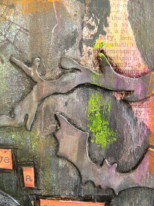
First I die cut my house, graveyard, bat and branches from black, heavy card and fussy cut my witch portrait.


For her hat I first drew a rough sketch on some white paper and cut that to size and into shape until I was content. Then I simply traced the outlines to transfer the shape to some black heavy card.


Next I made sure all my cut out parts found their proper spots on my square piece of card.


I wanted the die cut elements to kind of form a "frame" with a slight shadow-box-like effect (due to some overlaps here and there) so the focus would be drawn to the centre and the portrait of my witch.

Once I was content with the arrangement, I removed the pieces and gave my substrate a thorough coat of black Gesso.


After it had dried, I glued all the cut out pieces and some torn dictionary page scraps in place with Matte Medium and made sure I also covered the fronts and whole piece with a thin layer of it.


Then I started adding various washes of Titan Buff, Burnt Umber, Dark Grey Val. 3 and Quinacridone Violet in that exact order (sparing the area with the witch in the centre).


Next I added some Gold Green here and there, dabbing off any excess with a baby wipe where I had added too much. I also made sure that the portrait and hat stayed clean of any paint during the whole painting process. As I had covered everything with the Matte Medium before, wiping off and removing any paint was easy and still possible.


I stamped some texture onto the gravestones. Because they were the topmost layer of die cuts, the rubber stamp would not reach the  layers at the lower levels. I just had to make sure I fixed the cling stamp to an acrylic bloc so it stayed flat during the stamping process.


Then I applied a thin coat of Crackle Glaze to the hat (using a soft brush) and let it dry naturally. (sorry, forgot to do a picture of this step).

In the meantime I scraped on a little black Gesso with a small palette knife to blend in the glued on dictionary page scraps and other elements with the background.


 By now the Crackle Glaze I had applied to the hat had dried - so I gave it a coat of white Antiquing Cream to make the cracks visible. Make sure you let the Antiquing Cream dry before you start wiping the excess off with a lightly damp cloth - otherwise you will also remove most of it again from the crevices!


Now it was time to add a little stamping (spiders and webs) and then shade in all the glued on elements to make them pop a bit more from the background (and also to add more depth). I found that drawing outlines with the brush tip of my black soot Distress marker and then smudging them with my fingertip works best and fastest. But this only works on a surface that has been sealed before (either with Matte Medium or matte Decou-Page) and therefore isn't absorbant anymore!


 I added a sentiment that was cut into single word tiles and glued on with Matte Medium.


I also made sure they all were covered well with the Matte Medium, so I could do the shading-around (= drawing and smudging) with the Distress marker.


For a finishing touch I needed a visual frame, so I dabbed and smudged on some Cadmium Orange Hue with my fingers and let dry.


Next I did the same with some Carbon Black paint, making sure I didn't cover up too much of the orange paint.


I drew thin outlines around the word tiles and my painting's edges with an ultra fine tip china ink pen:


As I was missing some small dashes of a brighter colour (for contrast) I dabbed and smudged on some more Gold Green with my fingertips until I was content with the look of my project. Done!


I hope you like it and are having a lot of fun creating for Halloween too!!!


Hugs and happy crafting,
Claudia 
xxx