Friday, 30 January 2015

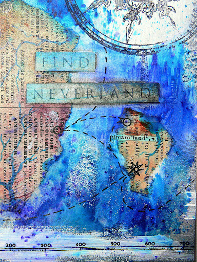
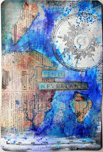
How to Find Neverland?

Well, use a map of course. ;)


Making maps is something I loved to do as a kid and I can tell my pupils loved it too when being asked to draw maps leading to secret hidden treasures on some island yet to be discovered!

And I found that it still is a wonderful thing to do today - only with other media at hand than back in my childhood days. ;)


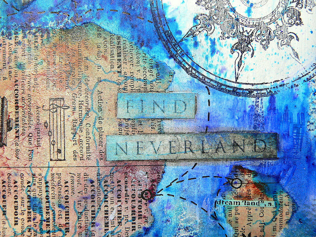
Another art journal card (measuring 4x6'') I did using rubber stamps and designer paper (from 7 Dots Studio's "Destination Unknown" collection), Brushos, old book pages that had been coloured with washes of earthy tones first, white Gesso and a black china ink pen.


As the Brushos always re-react when getting wet (which also happens when getting in contact with glue for example) this is a rather "accidental" technique in which you have to either embrace imperfection (which gets a loud "YES" from me) or simply wash off too much colour by adding clear water with a soft detail brush and dabbing it all off with a piece of dry cloth.

You can of course also seal your piece with a spray-on sealant before continueing to work on it. But I actually like how the blue spread on the glued on pieces as well and made them blend in this way.


The dictionary pages had been lying on my desk for ages. I had painted them with some left over colour washes for a different project (as I hate to waste anything)...not knowing what to use them for back then. But they make a beautiful mainland, don't they?

Hugs and happy crafting,
Claudia xxx


Tuesday, 27 January 2015

Our Creative Corner RGD - Sneak Peek

Servus and welcome to my first invitation to go visit


 and find me doing my very first post as their Resident Guest Designer (RGD) today.


Lovely Laura gives me plenty of rope with this....so I can share any art projects and techniques with you that come to my mind. How lucky am I?!

For starters I want you to hop over and meet Umberto, the strongest man of Donaustadt (which is the district of Vienna I live in). Well, he actually was the strongest man back in the 20s as the condition of the photograph and the style of his moustache show ;)


I hope you will like him and have fun with the tutorial (which is in multi-color of course *lol)! As you can see from the sneak peek image there will be a lot of action and vintage moustache fun.


Hugs and happy crafting,
Claudia 
xxx


Saturday, 24 January 2015

Rigby Post Ephemera Subscription Box - a Product Review and a Project

Servus and welcome to a special post today!


I received an email some weeks ago in which lovely Arcadia from Rigby Post asked me if I was willing to do a review post about her hand collected ephemera subscription box on my blog and on that occasion also create something with the goodies inside - and of course I said "Yes, please!!!!!" as I love ephemera - especially those that have their own history and stories to tell!


http://www.rigbypost.com/


Let me tell you that this box is so much more than just a bundle of ephemera and embellies to use on your projects! It already spread the most inspiring mood when I opened it for the first time! So don't be too surprised when you find me writing in a rather high-spirited tone today. ;)


There were some text sheets included - one being a lovely letter, one providing an inspirational how to with suggestions on a tag to create from the contents of the box and a third sharing thoughts about working with objects that have their own history, about mindfulness and taking pace out of one's life, which isn't always easy to do during these days.


Reading the thoughtful words about art, inspiration and being mindful, really got me in an inspired and relaxed mood (even though I was already curious to find out about the contents of this treasure box of course ;) and - what's most important - made me feel as if was putting myself in for a wonderful treat while working with the contents - which definitely is the case!

Then I finally decided to flip aside the bright orange tissue paper that had kept the old papers and other pieces safe (and which I also used on my project - you know me - I really love to use packaging materials and used papers of all kinds)!


And, boy! I really loved what I saw! Loads of highly textural papers, ribbons, ephemera and card, a little pocket containing small treasures and some dashes of beautiful colour! (Did I ever mention that orange is one of my favourite colours?)


Mmmmmh! A map and music sheets! 


Aaah! Awesomely aged and yellowed book pages!


Love that maths work sheet and the score sheet, the brown packaging paper and the tag!


Some colourful twine and lovely fabric tape alongside a piece of old linen or cotton cloth and a slightly sparkling rough jute ribbon.


And then there was this small plastic bag containing some lovely treasures:


Oooh! A scrabbe tile, vintage buttons, gorgeous lace ribbons and I looove that little red and white bunting ribbon! I wasn't sure what I should use the white paper flower for (as I don't use these normally)...but it showed later (while creating with all my goodies from the box) that it was just perfect for....erm...I guess I won't tell you right now...just read on and find out for yourself! lol


So there they lay - my new treasures! 


And they inspired me to create this little wall hanger:


All materials used on this project - except the card it is made on and from - are from the lovely Rigby Post ephemera box! For this project I decided to follow the colour scheme given by the box' contents.


See? There's the orange wrapping paper - used on one of the houses. These were die cut from some leftover card (packaging material from a T-Shirt hubby bought) using the Sizzix Artful Dwellings die.

Then the houses were covered with papers from the box (using matte Decou-Page).


Once dry I added ribbons and buttons, pieces of cloth and the white paper flower to create doors, windows, roof tiles and house number signs.


"The white flower?" I hear you ask. "How would you use a white flower for this?". Well....


....I found that if I cut them apart, the flower's leaves would make perfect roof tiles. Don't they?


Once all my paper pieces and tiny bits were glued in place, I started doodling and painting and adding small word tiles which I cut from scraps of some of the pages I had used to cover the die cut house shapes with.


There's the refection of the outside on the window. I love the sound of church bells through an open window.


I used acrylic paints, my black Stabilo Marks it All pencil and a white Sharpie to add all the detail.


At number seven lives an "A.....a Borealis", as the door bell sign shows. Sadly the first name is illegible. Maybe it is "Angela", "Agneta", "Alberta" or "Arcadia"....who knows. ;)


And the lovely piece of lace ribbon was just the perfect fit for the largest of the houses! I didn't even have to trim it! So it was obvious where to put it.


I hope you like my first project done with all the lovely vintage stuff from the ephemera box! As there is still plenty left there might well be more to come. ;)


If you are interested to find out more about the Rigby Post ephemera box check out the information on their website - which can be found HERE (or by clicking the website's logo).There are options to do a one-time buy, a monthly subscription (so you make sure you will get one as they are limited because they are made of selected original vintage goods) and a half year subscription (for those who want to save some bucks).

http://www.rigbypost.com/

Thank you, Arcadia, for asking me to review your box! I had so much fun! Guess I will get me another one of those when I feel like I am in for a treat or need something to cheer me up! ;)

Hugs and happy crafting,
Claudia 
xxx

Wednesday, 21 January 2015

Birds, Birds, Birds!

Seems I have caught the birdy-virus recently....as today I want to share another art journal card featuring one of our feathered friends ;)


To create this card I used some of the lovely Red Lead Bird masks and stamps, black archival ink, Brushos, some white gauze, DecoArt media Misters and Decou-Page, old dictionary page scraps and a cut in half postal stamp sticker.


I knew that the Brusho colours would re-activate once I was going to spread the sealant over the glued on bird shape, but I was hoping it might have some slight "aesthetical smudgeing" effect on the gauze...and got lucky. ;)


The bird's feet and outlines were drawn with a black china ink pen and the colour from the Misters was sprinkled on randomly.


Well, I am afraid (or should I say sure?) that this wasn't the last bird creation to be seen on my blog...so...watch out for those birdies! ;)

Hugs and happy crafting,
Claudia xxx
Monday, 19 January 2015

Now that CHA is over - Part I

Now that CHA is over I am finally allowed to share my creations for the DecoArt booth with you. So this is part one for a start.  :)


It was an exciting and also strange feeling to know that even though I could not go there myself, there was at least someting "of me" there to be seen. (not sure what I would like better...erm....well, no - it definitely would be seeing all the fab artists demoing at the stands to be honest. But having some of your own work showcased is soooo cool too...lol ;).


As we were asked to showcase the new fantastic media line DecoArt have develloped with Andy Skinner, I tried to combine as much as I could on one piece. So I made the background this LO is created on myself - using DecoArt stencils alongside the media fluid acrylic paints, Crackle Glaze, Antiquing Creams and Translucent White (which is one of my favourites when it comes to creating subtle shading and texture).


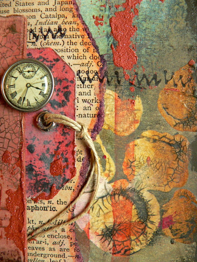
This image shows the result of the Crackle Glaze applied through a large dots stencil over a layer of painted and dripped on colour washes (I had made using the media fluid acrylics) and being coated with a layer of Carbon Black and Patina Green Antiquing Creams (and the excess being whiped off after all had dried) afterwards. The Patina Green toned down the bright yellow, orange and red tones but they remained bright and visible underneath the Crackle Glaze. The Carbon Black Antiquing Cream accented the cracks.


I also scraped on some Red Iron Oxide Texture Fierro with a palette knife to make all the elements blend in with each other and add some more texture.

Scraps of old dictionary pages were torn and glued on (rather) randomly (using the matte Decou-Page).


I also used the Crackle Glaze on a colour copy of an old photograph (a fleamarket find) and the metal embellishment on top was painted with media fluid acrylics which I "cooked" onto the metal using the heat tool.


The pocket watch frame was a flea market find too. I toned it down a little using a wash of Transparent Red Iron Oxide fluid acrylic colour.

The flourish was a cast from a selfmade mould made using self hardening model clay and painting it with the media fluid acrylics to give it an aged and worn look.


Hints of Turquoise Shimmer Mister paint were sprayed on through a stencil and also simply sprinkled on by pressing the nozzle only lightly.


Embellishments were glued on using matte Decou-Page. My first choice of glue when it comes to adhering heavier items to a project.


Additional texture was stamped on using black archival stamping ink with text and texture stamps. Ephemera, cut out (stamped) word tiles and various embellishments were layered and glued on as well.


For a finish I glued the LO to some heavy card and then dabbed some DecoArt Traditions "Raw Umber" acrylic paint directly with the fingertip around the edges of my paintboard to "hold the design in place". I like using the fingertip as you get an uneven border that looks close to peeled off paint around the edges.


I had a wonderful time completing this project. Working with old photographs is always a rewarding thing to do as you feel you have to create a "precious frame" around them to do them justice (which can also make it a bit intimidating sometimes *lol). And when you find - once you're done - that this frame has given the image "new life", you know you have succeeded.

It isn't always easy to not overdo projects (and those who know me know pretty well that my designs tend to be rather "crowded"...but I love to take the eye of the beholder on a journey with a lot of wonderful things to discover and not just spot the focal piece and have all the roundabouts be less important in a way. Hope this makes sense ;)

Hugs and happy crafting,
Claudia xxx

http://decoart.com/mixedmedia/