Friday, 29 April 2016

Art Journaling with Yupo, Alcohol Ink, Washi Tape and Distress Crayons


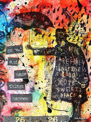
Tim Holtz' new "Sideshow" stamp set was one of those I just knew I had to have when I first saw it! And often I find it quite hard to work with stamps that already have a kind of "finished collage" or -drawing" look - but I found that they are perfect for using them with alcohol ink backgrounds created on Yupo! So I created this journal spread today:


I have recently started experimenting with alcohol ink on Yupo (over HERE) and came up with this background that I gave a finish by rubbing over it with a soft cloth (applying pressure) - which kind of smudges the ink stains and creates this softer effect:


I originally thought of painting over this one and doing a flower themed Yupo painting (as some of the shapes look like blossoms) - but as you can see: I changed my mind.


So I stamped on the images using black archival stamping ink, cut them out and glued them to my journal pages. Then I smudged some black soot Distress Crayon around the edges and added some rubber stamping.

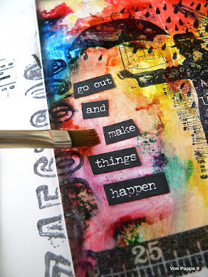
To make the chit chat stickers more visible I used a soft brush that I loaded with water to lighten the outer edges and to soften any edges from alcohol ink stains.


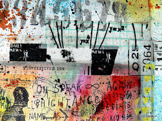
I added bits of washi tape here and there.


Then I did some stencilling using Distess Crayons (using my fingertips to "rub" them through the stencil onto the page) and added some spritzes of Distress Spray Paint.


For a finish I drew a thin border around my pages using a permanent marker.


Some details:


Thanks for stopping by!
Hugs and happy crafting,
Claudia 
xxx


Tuesday, 26 April 2016

Experimenting with Yupo and Alcohol Inks

Hi and servus again!

This is my second post today - and if you have missed my short early morning invitation to my new tutorial, please, scroll down to the previous post where you will find the link to the tutorial over at Our Creative Corner.  ;)

In this post I would like to share a new passion of mine: Yupo paper!

I have only just started experimenting with Yupo paper. It is a synthetic paper that makes a lot of media "behave" differently than on normal paper. So you can create great effects on it with inks, alcohol inks, acrylic paints and many other media.

I started with alcohol inks as I love how they spread and create these beautiful patterns on the Yupo.
Here are some experiments with different ways of application, using Isopropanol, diluted inks, stamps, mark making tools...


#1
 I simply let the alcohol inks drip from the bottle onto the Yupo. 
The lighter tones were done using diluted alcohol inks and a pipette. 
To dilute the alcohol inks I used Isopropanol.

I only used three different colours by the way. They mix this beautifully on the paper - simply by adding more layers of inks and/or isopropanol. 


#2
I sprayed a mix of Isopropanol and water onto the dripped on alcohol inks and created some running lines.


#2 detail


#3
I used diluted alcohol inks and tried to create smaller splatters using the almost empty pipette. 


#4
I used mixes of heavily diluted alcohol inks and pure Isopropanol to create layers of drops of all sizes.


#5

I used Isopropanol and rubber stamps, bottle caps,  ribbon (dipped into Isopropanol) and other tools to create marks. The black script was stamped on using black archival ink. 


detail:


#6
I used pure alcohol inks. isopropanol and soft scraping tools to spread the inks. 

detail:


#7
the same procedure with heavily diluted alcohol inks


Working on Yupo is such great fun! 
Thanks for stopping by! 

Claudia
xxx

It's Sneak Peek Time Again!

Servus, my dear and true readers and followers - old and anew!

I am happy to see you stop by again and would love to invite you over to Our Creative Corner where I have a short and easy tutorial for you that is meant to take you further into experimenting with die ink and trusting your own brushstrokes.
Also again I have been creating layers (as I always do) and am taking you through the single steps of the process.

Here's a little close up so you can get an idea (and hopefully decide to hop over and find out a bit more):


To get to the blog post click HERE. I would love to see you over there! Also make sure you don't miss the last few days to enter the fabulous "Gipsy Fayre" challenge hosted by lovely Candice!

Hugs and happy crafting!
Claudia 
xxx


Thursday, 21 April 2016

Because you're beautiful!

Hi, servus and welcome to my little creative spot!

Today I would like to invite you to play along with us at Emerald Creek's latest Dare which is

"It's a Charmed Life!"

and goes out to all the ladies, celebrating women all around the world! My personal interpretation of the theme is based on a song by Christina Aguilera that I really love - because the message of it is so important - to all of us. But today I dedicate the song and my project to the women in the first place.


I am especially fond of this specific picture from Tim Holtz' photobooth collection  as it reminds me of one of my lovely great aunts whom I both loved and admired very much as they were brave women standing up to some hard lessons life gave them - and managing without any men standing by their side.


Products used for this project:

Emerald Creek Hearts and Flower Pin Wheel brads
Emerald Creek Burnt Copper Leaves embossing powder
Ranger Adirondack Alcohol inks
Tim Holtz photobooth pack


I started with die cutting the ornate frame from heavy black card and the pieces I wanted to use the alcohol inks on from white modelling film (that can be shaped while heated). 


Then I heat embossed the ornate frame with the awesome Burnt Copper Leaves Emerald Creek embossing powder and set it aside. 


The laurel wreath was coloured using Ranger Adirondack Alcohol Inks in three different greens. 


Next I used different browns on the banner. 


As I wanted to stamp a quote on the banner and wanted it to be well visible, I used some nail polish remover and a cutton bud to remove some of the inks. 


The tattered florals were coloured using a mix of alcohol ink tones (as shown in the picture...to enlarge click on the image).  


I glued some Tim Holtz designer paper to a cut to size foam board panel and shaded the edges using Distress Crayons and a slightly wet brush. 


The heat embossed frame and cut to size picture were glued to the panel and blended in with Distress Crayons as well. I find the #3 of the Distress Crayons sets veeeery helpful as they correspond with the Tim Holtz designer papers so very well!


One of the Emerald Creek brads was meant to become the centre of my tattered flowers. To highlight the details on the brad I used the antique linen Distress Crayon with the raised areas of the brad. 


I fixed all my parts to the panel using sticky tape and/or matte medium. 


To cover the white edge of the foam board I used black thin washi tape. 


So here's my project for Emerald Creek Dare's "It's a Charmed Life!" challenge. I hope you like it and hop over to take a look at the highly inspirational pieces my lovely team mates have created for you! 


Hope to see you play along with us soon!
Hugs and happy crafting,
Claudia 
xxx


Monday, 18 April 2016

Old Journal Spread Revisited

Browsing my image archives today I found a journal spread I did for DecoArt for CHA 2014.
I haven't shared it so far because first of all I simply forgot about it and secondly its content is about a personal issue I had been struggling with for a long time back then...and I know not everyone wants to to be confronted with more earnest or sad topics being displayed in art.

But hard times go by and we learn and move on and get better with each crises. And also fortunately the human brain is programmed to forget about how hard it really was "back then". So we can look back at our lives without feeling that same pain again.

For those who don't want to read any sad or earnest stuff - please, move directly on to the images section with the how-tos. I am not offended if you do so (and I won't know anyway...lol).

In my life there had been deaths and deadly or serious illnesses of family members from the time when I was six until my late thirties and even though my mom tried her best and did an outstanding job raising her two daughters as a widow (and loosing her mother only three years after loosing her husband), I know now (as a grown up) that she lost her trust in fate back then and part of her simply gave up on trying to be happy again. I never felt that I didn't have a good childhood though...but my heart (or inner child or however you like to call it) never learned "happiness" and to trust in fate. And sadly this is something that cannot be fully caught up on once you are a grown up.

That doesn't mean I am sad all the time. I am not. On the contrary - I laugh a lot. I smile a lot. I like to tell funny stories. I know what makes me happy and how to enjoy good times. And I am very aware and thankful of the many everyday life things that can make us happy - and there are a lot if you are on the lookout. I enjoy and treasure all of it - but it will never become a "natural feeling" for me. It always takes a conscious "act of will" for me to be happy (or at least close to) - if you know what I mean.

But enough of that. I really do have a good life. I am loved and have wonderful precious people I can love back. And I am constantly working on adapting to my "new life with chronic illness". It isn't as dramatic as it may sound, but it also isn't easy and honestly there comes quite a learning curve with it - and a lot of ups and downs.  Which brings me to my journal spread that was made after one of those downs:


Looking at this spread almost two years later, I recognise that my "sunlight" that I recommend trusting in, still looks a bit scary with all the zig-zag-ish and pointy "sunbeams". I don't think that I did the sun (to the right...just in case you struggle with spotting it) like this intentionally - it just happend to come out like it did and I totally blame it on my subconscious. But honestly I smiled today when I saw how it made me do the sun...a sun that was meant to be warm and gentle. Which it definitely isn't on my journal spread.

But hey - it perfectly represents my feelings...the ones I obviously don't have as much control over as I would like to. ;)

I have left those dark times behind. I know that and I can feel that.
But sunlight is happiness - and part of it will always scare me. At least a bit. So my sun is more that of a desert, burning trees instead of making them grow if I look at it closely...(the longer I look at it the more it makes me smile and chuckle honestly).

But on my journal page the person is reaching out - and I am sure he or she can already feel the warmth (even though it feels still a bit scary)...and that it is a good and healing kind of warmth.

But even though I wasn't very content with the shape of my cut out figure back when I made this spread, I now think it perfectly shows this timid approach in all its attitude. Not running at full speed towards the lighter times. But its back is definitely turned on darkness - so someone is on his or her way. And we all know it's small steps when recovering from hurt- and stressful times. So the words "explore" and "journey" are there and exactly where they should be.

I started my spread with a sketch.


Then I added some black acrylic paint to the left as a background and glued on some chipboard arrows and cogs and rough ribbon.

The sun was done scraping on white modelling paste and scratching lines into it with the side of the palette knife.


These were painted with black acrylic paint too so I could dry brush them later.


I worked with a reduced colour scheme and fused the right yellow side with the black left hand side via a grey section. This picture shows all the colour tones and media used on my journal spread:


The paints were  blended directly on the pages while still wet to create a soft blending effect from the black left to the light yellow side. But I also made sure there were visible brush strokes as well.


I stamped on some crackles with black archival ink to add a bit of detail to the background. Then I dry brushed the black glued on pieces with shades of orange and yellow to make all the texture pop.


The bird, tree and lamp post were stamped in place and the stamped and cut out quotes and figure were glued in place too.


The edges of the single quote tiles were shaded using a back watersoluble pencil and a wet brush.


 A bit of white Gesso was scraped on the background and the sun for more detail. The figure's edges were outlined with a black and brown watersoluble pencil and blended. Voilá!
Sadly this piece got lost after CHA, so I never got it back. But here it is now (at least virtually) ;)


Thanks for stopping by! 
Hugs and happy (and I mean it) crafting,
Claudia 
xxx