Hi and servus and welcome back to another little scene I have created using dies and stencils and today I have decided to share a full and detailed how-to with you as sometimes the results don't show all the necessary steps there are to professional layering with masks and stencils.
You have already seen me recently use dies to create masks and stencils (or for drawings) for the projects over
HERE and
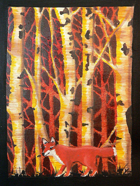
HERE but this time I have taken the technique a bit further to create this autumnal scenery in my art journal:
You know - the Vienna Woods really look like this in autumn...especially close to sundown and with all the red leaves lying on the ground.
The forest and the fox are both done using masks and stencils (created from the fabulous new Tim Holtz "Birch Trees" Thinlits die and part of an X-Cut Create a Scene die set).
Using two stencils in one go provides a lot of new opportunities for creating a lot of depth - on my art journal page I used the lovely Dreamweavers stencil alongside my self-cut "stencil" done with the Birch Trees die (using some heavier white card for more rigidity).
The image above shows the Birch Trees "paper stencil" to the right - after use together with the metal Dreamweavers forest stencil. The effect on the page already looks pretty cool, but I wanted to take this all even further and add more depth by adding colour.
But let's start with the start - the preparation of the journal page!
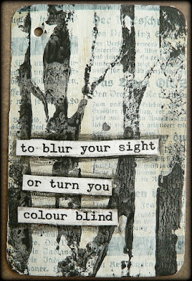
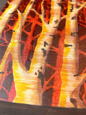
With a worn wide bristle brush I added some brush strokes in medium white and two different browns - making sure the paint was rather dry on the brush so the strokes from the bristles would be visible. I created horizontal brush stroke lines as these would later imitate the bark texture of the birch trees.
When that was dry I placed the die cut birch trees (paper) stencil
underneath the forest stencil and fixed both to my journal page with masking tape so they would stay in place.
Then I stippled on some dark grey acrylic paint with a stipple brush. After removing the stencils the page looked like this (with the wider trees in the foreground and the thin ones in the back - but still rather "flat"):
You could of course leave that forest as it is, as it already looks quite good, but I wanted to add more colour and create the illusion of depth.
So I placed the birch tree stencil (the one I cut from paper using the die) once more on my page - making sure the shapes of the birch trees all lined up again - and stippled on some transparent acrylic paint (in my case I used Quinacridone Burnt Orange). The transparency of the paint still lets some of the texture underneath show through.
And this is how my page looked like afterwards:
You see that the stippled on orange paint also got into the spots where the bark of the birch trees was meant to have its typical dark spots...so I went in with a fine tip brush and "repainted" these with the dark grey I had used at the beginning.
That looked much better now:
Next I needed a bit of dimension....so I began shading in some light orange to one side of the trees' trunks. I did so by using a small flat brush and only little paint - most of which I first brushed on the other page of my journal to get an effect close to dry-brushing. It is important to always paint the same side of the trunks as the orange colour is meant to be the reflection of the sunlight (which emerges from one point mainly - so imagining the sun and her position as a lit light bulb often helps concentrate on where to add colour and where not)
Now I found that I needed a frame to help make clearer where the birch trees "ended". So I roughly painted one using black acrylic paint and a wide soft brush.
Then I did some more shading - this time on the shady side of the tree trunks with some Burnt Sienna and my brush and for a finish with my "ground espresso" Distress marker (smudging the drawn lines with my fingertip as long as the ink was still wet).
At that point I had several ideas on what to do with my autumn forest painting so far:
I could have cut it out and used it on a card alongside some die cut sentiments for example, but I wanted to do some more painting...
...so I decided to add a fox to the scenery. I had a fox die from the lovely X-Cut Create a Scene "Woodland" die set (that I used
HERE), so I used it to create another stencil.
And here's how to do the fox:
1. Stencil on some orange paint. Let dry.
2. Paint on the white spots (feet, tail, ears and mouth). Let dry.
3. Draw the nose, eyes and claws with a fine tip black china ink pen.
Well, there it was...but the ground it stood on didn't fit at all - it simply wasn't a "ground" but only the end of the painting. So I took a very small fine tip brush and some black acrylic paint and painted some forest ground (like mushrooms, sticks, grass and such).
Now that looked so much better!
And I was done.
I hope you like my page and the how-to! AND I hope that you maybe even dare try this for yourselves! I would love you to share your sceneries done with this technique with me (maybe leave a link with the comments section?)!
Dies are one of my favourite things to experiment with as they can be used in so many more ways than just the obvious ones (although I love the "obvious" ones too...lol).
Thanks for stopping by!
Hugs and happy crafting,
Claudia
xxx

