Friday, 26 February 2016

RGD-Time over at OCC!

Which means that it is "Resident Guest Designer" time for me over at Our Creative Corner...lol.

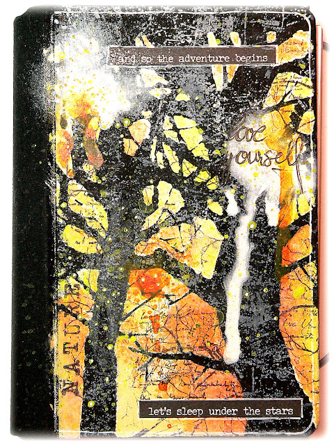
I have prepared a project and tutorial for you over there that shows how I turned an unused (or partially used to be more precise) time planner from 2015 into an "experimenting journal".

Not much experimenting in it for now...but at least the cover is done and I am taking you through the single steps of that process. And this is the result:


I had to instantly use the awesome Brett Weldele "Creepy Trees" stencil which I finally managed to get without having to pay twice its price for shipping costs over to my place. Yay! 

So if you are curious now about how I made that cover, just hop over to Our Creative Corner and check out today's post. I would love to see you over there!

Hugs and happy crafting,
Claudia 
xxx

http://ourcreativecorner6.blogspot.com/2016/02/make-your-own-expermenting-journals-by.html


Thursday, 25 February 2016

Lucky Clover - the new Dare over at Emerald Creek!

Servus and welcome to the start of the latest of Emerald Creek's Dares!


With St. Patrick's Day fast approaching the theme for this dare is 

"Lucky Clover - Bring on the Green"

by which we want you to think Irish, greens, clovers, gold, leprechauns, beer,....


...and except for the beer and the leprechauns I have incorporated all of the above with my tag:


To create this tag I used stuff most of which can be bought at the Emerald Creek Online store:

Emerald Creek St. Paddy's Day embossing powder
Emerald Creek Flower Pin Wheel brad
Distress paints: peeled paint, mowed lawn, twisted citron, squeezed lemonade, tarnished brass
Distress inks:  hickory smoke, black soot
Ranger blending tool
Ranger heat tool
Ranger craft sheet
Splatter brush
Dreamweaver stencil (Irish ornament)
Embossing ink dabber
green lace ribbon
double sided sticky tape
permanent fine tip black marker


The tag may look quite simple in its making at first glance, but I paid a lot of attention to smaller details as I wanted a simple desing and also the ornament and brad to remain the focal pieces without having anything drawing too much attention off them. On the other hand every spot on a project should be done properly and with purpose and play its own role in enhancing the main effects and look.

So the first thing I did was use some of the delicious greens from the Distress paints range to create a marbled background.


I also used a fine tip brush to sprinkle on some Distress paint while the other paints were still wet, taking the paint directly from the unscrewed bottle.

Then I cut a tag from that part of the marbled card I liked most, using my Sizzix and the Tim Holtz "Tag and Bookplates" die.


To make the greens on my tag pop a bit more I blended the whole tag with Hickory Smoke Distress ink, using my blending tool.


Using the awesome "St. Paddy's Day" Emerald Creek embossing powder, the lovely Irish ornament Dreamweaver stencil and an embossing ink dabber I created my focal piece to which I wanted to add the gorgeous Flower Pin Wheel brad later (as I find it looks like a four leaf clover).


To enhance the contast I added some black soot Distress ink around the edges and the heat embossed image.
See what a difference that makes?


Next I added fine splatters of "tarnished brass" Distress paint using the fab splatter brush I recently helped myself to. (love it!!!)


At that point I decided to make the Irish ornament pop even more and add some black line drawing to my tag.


To have this not be the only area on my tag with black line drawing I also added a thin outline to my tag and the hole on top. Repeating techniques (or colours, shapes or patterns) on a project helps make them become less prominent and more part of the whole design. It will also help blend in my planned on handwriting.


I used some embossing ink from the dabber and spread it in three different areas on my tag with my fingertip - to repeat the texture and colour of the St. Paddy's Day embossing powder too.


To add my handwritten sentiment I first wrote it on a piece of paper...trying to already find the appropriate size of the letters and widths of the lines.


Then I cut these out and positioned them on my tag to find the best places for them (regarding composition).


I decided to go for the second version (even though I like the first one too). Having the cut out word strips also helps with writing directly onto the tag afterwards as you can simply move them up a bit and use them as your model to follow.


Using handwriting instead of glued on word strips also is the better choice if you find the word strips too dominant with a design. Of course you could also glue these on directly if that looks better. But writing directly onto the created background always is the better means to "fuse" your text with the project.


For a finish (and to repeat the lighter greens from the background) I added some green lace ribbon using double sided sticky tape. Then I painted my Ds, Os and Rs with squeezed lemonade (using a very fine detail brush)...


 ... et voilá!


Not tired of greens and clovers yet? Great - then hop over to the Emerald Creek Dares blog to check out the makes of my fantastic teamies!!!

Happy St. Patrick's Day!


Hugs and happy crafting,
Claudia
xxx


http://blog.emeraldcreek.ca/


Monday, 15 February 2016

Steampunk is Art - SanDee&amelie's February Steampunk Challenge

Servus and welcome to my mid-month reminder post for the February challenge over at SanDee&amelie's!


As our challenges are all "Anything Goes - Steampunk/Industrial" for this year, the design team and our players are free to follow their hearts and create and use whatever media they are up to at that very moment!


I haven't done an art journal card for ages and had almost forgotten how much I enjoy working on this special format! Let me take you through the single steps - but before I do that I also want to invite you over to our challenge blog so you can check out my wonderful teamies' projects and maybe also pay them a visit too!

I started out with some die cuts and torn scraps from old designer papers, book pages and other ephemera that I glued to my journal card using "Antique" DecoArt Decou-Page (which has a light brown-ish tint already...so it adds to an aged look of your project already while preparing the background).


Next I added washes of diluted DecoArt Media fluid acrylics Transparent Yellow Iron Oxide, English Red Oxide and after that Cobalt Turquoise Hue. I dried my journal card well with a heat tool before I added the next colour.


I love where the washes pooled up and created drip lines and therefore highlighted the glued on die cut piece!


Next I stamped on the beautiful Carabelle Studio light bulb image in black archival ink and used a white gel pen to outline the image and also add the word "ART" by using letter stencils.


The letter shapes were coloured using a watercolour marker of a light brown colour tone - which is a subtle effect but still adds some depth and interest. As watercolour markers are transparent the paint and texture underneath remains visible which was what I was aiming for. 


I finished my journal card off by adding some sprinkles of turquoise DecoArt Media Shimmer Mister and diluted bronze DecoArt Dazzling Metallics paint (using a splatter brush for the latter).


To make the white doodling on my journal card blend in I drew a thin white border around it. That helped keep my white drawing and handwriting in place and also draw the focus towards them.


Here are some more close ups as usual!


I hope you like my art journal card and feel inspired to play along with our steampunk/industrial challenge!!!

We also have another great new sponsor who has joined in with us - Glenda from boozybear - and she is offering the most beautiful steampunk chipboard pieces - so make sure you check that out and don't miss the chance to win some!!!

https://www.etsy.com/shop/boozybear?ref=offsite_badges&utm_source=sellers&utm_medium=badges&utm_campaign=en_isell_1


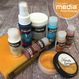
And of course there is that great DecoArt Media prize bundle to be given away to one randomly drawn winner among all proper entries as well!


http://decoart.com/mixedmedia/


Hope to see you over at our challenge blog soon! 

Hugs and happy crafting,
Claudia 
xxx
http://sandee-and-amelie.blogspot.co.at/2016/02/our-february-challenge-and-some-great.html


Thursday, 11 February 2016

Another Dare at Emerald Creek!

Servus!
Today sees the start of a new challenge over at Emerald Creek Dares and this time it is an "anything goes" (which makes the dare a lot less "scary" ;)

http://blog.emeraldcreek.ca/


I decided to do another heart as I still have some blank ones left to alter and I love to create variations of a theme.


The gorgeous "Edison Bulb Charm" can be bought at the Emerald Creek online store as well as the embossing powders "Verdigris Sparkle" and "Burnt Copper Leaves".

http://www.emeraldcreek.ca/default.asp

Along with these I used some white air-hardening clay (to form the flames), Tim Holtz Distress inks, re-inkers, paints, markers, spray stains and Ranger Matte Medium to create the heart and the background panel.

I always love to get most out of my stuff and found that the Distress range is adaptable to a lot of mixed media techniques - and the marbling effect of the Distress paints is just so stunning and unique - I love it!

Here's the how-to:


First I dabbed some antiqued bronze and weathered wood Distress paint onto the wooden heart and while the paints were still wet I applied some drops of peeled paint and walnut stain ink directly from the refill bottles. Then give it a light spritz of water from the spray bottle to make the media flow.


Some of the effect gets lost when speeding up the drying process with a heat tool (like I did) - so if you really want this to be your main focus I recommend you let this air dry. And also keep in mind: the spots where ink has been added will reactivate when getting in contact with something "wet" (like paint or glue for example...but on the other hand this adds some exciting randomness to the process...which is something I love).

I didn't wait until all the paints had completely dried and sprinkled on some EC Verdigris Sparkle embossing powder - using the wet paint as an adhesive.


Next I did the same with some EC Burnt Copper Leaves embossing powder using Ranger matte Multi-Medium as an adhesive. You can see that it reactivated the peeled paint ink and made it pop more.


To make the Edison Bulb Charm match my heart's background colour I dabbed some antiqued bronze Distress paint onto it and dried it with a heat gun.


To give it a more grunge look I added some drops of walnut stain ink.


To make the ink adhere I "cooked" it onto the charm by thoroughly heating everything up with my heat tool.

Next I carefully dabbed some more antiqued bronze Distress paint  onto some spots of the heart to use as a "glue" for my Stampendous Fran-tage mica and teal flakes.


Once that was dry  stamped on some crackle texture using Ranger jet black archival ink and an Andy Skinner stamp.


To intensify the vibrancy of the greens and turquoise tones I added a contrasting colour - wild honey Distress paint - which I scraped on with a palette knife. I recommend you unscrew your Distress paint bottle and spread some of the paint with the palette knife on your non stick craft sheet first before applying the paint to your project. That way you make sure you don't have too much paint on your palette knife.


See how the warm yellow makes the dark green, the cool turquoise and shades of verdigris pop?

Once all was dry I fixed the charm to the heart using a small screw that I painted with antiqued bronze Distress paint too. I did some shading around the charm with a black soot Distress marker - using a damp soft flat brush to soften the outlines. 


To create my background panel I glued an old book page to a cut to size piece of sturdy card.


Then I sprayed the whole panel with Distress spray stains gathered twigs and rusty hinge and dabbed off the excess with a soft cloth.


Once that was dry I sprinkled on some water to create a stained and worn effect.


Once that was dry I darkened the edges with some walnut stain Distress ink and a blending foam.


As I had used the word "shine" on my project I thought I needed some flames on top of my heart. So I formed some from white air-hardening clay (I used Fimo but there are a lot of other brands) and once that had hardened I sanded it and painted it with the same Distress paints I had already used on the heart.


For the center piece I used a large half pearl. To make my flames match the heart I finished them off by adding some more wild honey Distress paint.


Now all that was left to do was assemble the pieces, add an idea-ology word sticker - et voilá!


I hope you like this heart project as much as you liked my first one (over HERE)! Thank you all so much for all the lovely comments on it!!!

Now, please, hop over to Emerald Creek Dares to check out my wonderful teamies' makes! I am sure they all will inspire you to play along! Hope to see you over there!

Hugs and happy crafting,
Claudia 
xxx