Showing posts with label Stampendous. Show all posts

Monday, 27 February 2017

Homo hahahbilis

Servus, hi and welcome back to my little creative corner, dear craftin' friends and followers! Thank you so much for stopping by!

Today I want to share with you another project I did as a member of the wonderful DecoArt media Design Team.

At times DecoArt team up with other manufacturers and this time it is Stampendous and their team whom the DecoArt media DT will do a blog hop with to celebrate the new Andy Skinner stamps! So look out carefully this March and visit the Stampendous and DecoArt media blog and their other social media platforms to not miss the kick off of a fantastic blog hop!

Three of my wonderful teamies will be part of this event and some more team members - including myself - will be featuring projects on their blogs during the next days and be showing off with Andy Skinner's new Stampendous stamps and the fab products from the DecoArt media line. So loads of inspiration are about to fuel your creative mojo! Here's my share - enjoy!


This skull of "Homo hahahbilis" as he has been named by its discoverer, Dr. Rufus Bellows, has only recently been excavated and forces anthropologists all over the world to accept that there has been another, much earlier and totally different human species that had the most amazing qualities and seems to have developped in a totally different direction than its later "colleagues".

So far scientists who have carefully examined the specimen dare assume that this much older species had its own means of protecting themselves against predators like the giant sabre-toothed tiger. They believe that these early humans could squeeze their own noses to have some acid liquid squirt from the inner corners of their eyes that would harm the attacker's eyes and thus win them enough time to escape.
They also have come to believe that the ostentatious red tufts of hair on the back and sides of the head were a kind of visual warning sign for predators to indicate that they were inedible, maybe even poisonous (like you still see it with certain caterpillars today for example).

***

The title "homo hahahbilis" was suggested by my son and I love it!!!! He also came up with "hoho erectus" which is just as genius, but I think we will have to wait until Christmas to meet this guy. lol

To create my mixed media foam board panel I used Andy Skinner's new "Skuldoggery", "Unexplained" and "Handle With Care" Stampendous stamp sets alongside the cracke stamp from his older "Industrial" set and of course a lot of DecoArt media fluid acrylics, Misters and Gesso.

I started with covering up a sheet of heavy mixed media paper with torn scraps of old magazines and dictionary pages. This time I used DecoArt's "Antique" Decou-Page as it already has a slight brownish tint to it and I thought that would add beautifully to the grunge look I was aiming for.


Once that was dry, I applied two thin coats of heavily diluted white Gesso to tone everything down a little. 


I stamped the clown skull image onto some heavy cardstock and cut out the skull shape with a precision knife so I could use both - the stencil and the mask. Then I placed my stencil onto the prepared substrate and thinly stippled on some white Gesso using one of DecoArt's Dual Sided Paint Pouncers


Next I stamped the skull image onto the dry shape using black archival stamping ink. As the surface was a bit uneven because of the glued and layered on paper scraps the image didn't come out too crisp - but I was expecting that and there is an easy way to fix that.
Of course I could have stamped the image onto a separate piece of paper and glued it on but I wanted to create a single layer piece this time and doing it this way it also fused the image with the textural background.


Then I stamped on the words and the barb wire and let everything dry thoroughly. 

I started adding washes of Transparent Yellow Iron Oxide, Quinacridone Gold and Phtalo Green-Blue. To make the skull pop from the background I painted a shading around it with Quin Gold. 


I placed the cut out skull mask on top of the stamped skull and scraped on some white Gesso as well as some Green Gold and Quinacridone Gold using a palette knife. I let the Gesso and each paint dry before I added the next one.
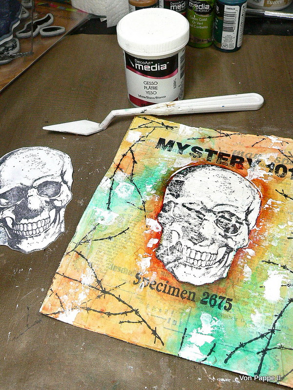


Then I toned down the skull with a light wash of Yellow Oxide.


The black areas that had gone missing because of stamping onto an uneven surface were painted back in with Carbon Black using a small soft brush. 


Then I started shading my skull image by adding Yellow Oxide to those areas that were in the shade. 


The light areas (that would be hit by the light of a punctual source like the sun) were highlighted with Titanium White as well as the teeth. 


This way the skull pops even more from the flat looking background. 

Time to paint the nose and shade it as well. 


The red hair was stamped on using True Red DecoArt Americana acrylic paint and the chin-beard stamp from Andy Skinner's Skuldoggery set. 


I covered the skull with the cut out mask again and added Red and Black sprinkles using the DecoArt media Misters. I also sprinkled on some white and turquoise Shimmer Mister paint. 


For a finish I stamped on a lot of scratch patterns with black archival stamping ink and mounted my finished painting to a piece of cut to size foam board using matte Decou-Page and four metal brads. 


I wrote the name onto the label and fixed the label holder to the foam board with two thin brads. 


I painted and doodled some structure in black to the red tufts of hair. 


This image shows how the layered on paper scraps create beautiful texture that shows through (see black areas):


And once more the finished piece:


Homo hahahbilis will probably remain a great mystery to the science world, but maybe there will be some more finds that will help reveal the secrets of this wondrous species. 


Hugs and happy crafting!
Claudia
xxx


Thursday, 11 February 2016

Another Dare at Emerald Creek!

Servus!
Today sees the start of a new challenge over at Emerald Creek Dares and this time it is an "anything goes" (which makes the dare a lot less "scary" ;)

http://blog.emeraldcreek.ca/


I decided to do another heart as I still have some blank ones left to alter and I love to create variations of a theme.


The gorgeous "Edison Bulb Charm" can be bought at the Emerald Creek online store as well as the embossing powders "Verdigris Sparkle" and "Burnt Copper Leaves".

http://www.emeraldcreek.ca/default.asp

Along with these I used some white air-hardening clay (to form the flames), Tim Holtz Distress inks, re-inkers, paints, markers, spray stains and Ranger Matte Medium to create the heart and the background panel.

I always love to get most out of my stuff and found that the Distress range is adaptable to a lot of mixed media techniques - and the marbling effect of the Distress paints is just so stunning and unique - I love it!

Here's the how-to:


First I dabbed some antiqued bronze and weathered wood Distress paint onto the wooden heart and while the paints were still wet I applied some drops of peeled paint and walnut stain ink directly from the refill bottles. Then give it a light spritz of water from the spray bottle to make the media flow.


Some of the effect gets lost when speeding up the drying process with a heat tool (like I did) - so if you really want this to be your main focus I recommend you let this air dry. And also keep in mind: the spots where ink has been added will reactivate when getting in contact with something "wet" (like paint or glue for example...but on the other hand this adds some exciting randomness to the process...which is something I love).

I didn't wait until all the paints had completely dried and sprinkled on some EC Verdigris Sparkle embossing powder - using the wet paint as an adhesive.


Next I did the same with some EC Burnt Copper Leaves embossing powder using Ranger matte Multi-Medium as an adhesive. You can see that it reactivated the peeled paint ink and made it pop more.


To make the Edison Bulb Charm match my heart's background colour I dabbed some antiqued bronze Distress paint onto it and dried it with a heat gun.


To give it a more grunge look I added some drops of walnut stain ink.


To make the ink adhere I "cooked" it onto the charm by thoroughly heating everything up with my heat tool.

Next I carefully dabbed some more antiqued bronze Distress paint  onto some spots of the heart to use as a "glue" for my Stampendous Fran-tage mica and teal flakes.


Once that was dry  stamped on some crackle texture using Ranger jet black archival ink and an Andy Skinner stamp.


To intensify the vibrancy of the greens and turquoise tones I added a contrasting colour - wild honey Distress paint - which I scraped on with a palette knife. I recommend you unscrew your Distress paint bottle and spread some of the paint with the palette knife on your non stick craft sheet first before applying the paint to your project. That way you make sure you don't have too much paint on your palette knife.


See how the warm yellow makes the dark green, the cool turquoise and shades of verdigris pop?

Once all was dry I fixed the charm to the heart using a small screw that I painted with antiqued bronze Distress paint too. I did some shading around the charm with a black soot Distress marker - using a damp soft flat brush to soften the outlines. 


To create my background panel I glued an old book page to a cut to size piece of sturdy card.


Then I sprayed the whole panel with Distress spray stains gathered twigs and rusty hinge and dabbed off the excess with a soft cloth.


Once that was dry I sprinkled on some water to create a stained and worn effect.


Once that was dry I darkened the edges with some walnut stain Distress ink and a blending foam.


As I had used the word "shine" on my project I thought I needed some flames on top of my heart. So I formed some from white air-hardening clay (I used Fimo but there are a lot of other brands) and once that had hardened I sanded it and painted it with the same Distress paints I had already used on the heart.


For the center piece I used a large half pearl. To make my flames match the heart I finished them off by adding some more wild honey Distress paint.


Now all that was left to do was assemble the pieces, add an idea-ology word sticker - et voilá!


I hope you like this heart project as much as you liked my first one (over HERE)! Thank you all so much for all the lovely comments on it!!!

Now, please, hop over to Emerald Creek Dares to check out my wonderful teamies' makes! I am sure they all will inspire you to play along! Hope to see you over there!

Hugs and happy crafting,
Claudia 
xxx


Thursday, 21 January 2016

"Valentines is not in the air" - Emerald Creek Dares

Servus!
So good to see you back! I hope you are all doing well and being creative!

With our "Valentines is not in the air" challenge Emerald Creek Dares are catering to the single people.

"This challenge is about hearts being done less lovey Dovey, red being used to represent something other then a significant other. And if you dare try going grey and see where it takes you."


http://blog.emeraldcreek.ca/


***

So the challenge still IS about love - as our hearts never stop beating for someone or something we love - a child, a dearly loved pet, our art or any other passion we love to follow. 


Psychology states that you have to be able to love yourself first before you are really able to truly love others. And I believe this is true! To love yourself means you are not dependent on any judgement or thankfulness of an opposite and that the love you give is free of any "bargain thinking"...if you know what I mean. You are then able to give love - no matter how much love you get back at that very moment. Simply because you feel like "lovin'" and because it makes you feel good.


But why is it so much harder to love ourselves than to love others? Why can we for example be so much more forgiving towards others than towards ourselves? Why are we our own and worst critics but accept (or even love) the imperfections and little flaws of others?


I believe that it mostly depends on how we were brought up and what we were "trained" to think of ourselves. And on how our own parents or models behaved towards themselves. Were they proud of what they did or did they always apologize and make themselves smaller and less "good" than their opposites (as my mom did for example)? Were you loved for who you were and at any time (like I was loved by my grandma) or for your accomplishments, specific behaviour or good marks only? Were you criticised for dressing, talking, thinking, behaving,...differently than "one should behave"?


It is all of that and a lot more that makes you who you are. And what makes you love yourself - or being constantly insecure or even displeased with yourself. I have a lot of dear friends and know a lot of people (including myself) who are so well trained to only look at their own mistakes and deficits that they have become real masters at it, without having to spend any efforts on disliking themselves.


So all of these were my thoughts that evolved from this "non-Valentines" theme - and my make (hopefully) resembles some of them - and a reminder to finally start loving yourself to be happier:


So this does not mean you should be more selfish of course! But a good kind-of "selfish" would do great for a start ;)
The kind of "selfish" where you pay attention to your own needs in the first place instead of always putting them behind the needs of others! (guess I don't have to mention that "helping others" can be such a need too).


But enough of that psychological blurb! Let's move on to the how-to for my mixed media heart panel! This time I want to show you how you can use Emerald Creek embossing powders alongside your Distress paints, stains and spray stains to create mixed media art. I hope you like my approach to using Distress differently (I always love to get back to my Distress products and use them in new ways - they are so versatile, it never gets boring to play with them and they always encourage and inspire me to experiment with them and try out new ways of using them - more than any other media!)


I started with applying Distress paints barn door, picked raspberry and antiqued bronze directly onto the wood heart and spraying it with water to get that awesome marbling effect the distress paints create.

While the paint was still wet I sprinkled some of Emerald Creek's awesome embossing powders Iron Stone Red and Pastel Mint on some spots and heated them with a heat tool.


I also applied some strokes of picket fence Distress crackle paint (yes, I still have some in my stash and it still works ;) here and there and while that was still wet sprinkled on some Stampendous Fran-tage "Bronze Glass Glitter".


Once the first tiny cracks started to appear I speeded up drying with the heat tool.


To make the cracks more visible I sprayed on some gathered twigs Distress spray stain and wiped off the excess with a baby wipe once the stain had seeped into the cracks.


Next I inked the heart's edges with a piece of cut'n dry foam and Ranger jet black archival ink.


After that I stamped on some crackle texture for more interest before I glued on my metal "1".


The metal number was a fleamarket find. I covered it with "antiqued bronze" Distress paint (as I did with the nails). The nails were easy to push in as the heart shape is made of balsa wood which is very soft.


To make the nails look more aged I added some black archival ink with a sponge.


I die cut a little crown from cardboard (using the Sizzix Tim Holtz Alterations "Mini Crown" Movers&Shapers die) and painted it with brushed pewter Distress stain onto which I dabbed some antiqued bronze Distress paint with my fingertip. The edges were inked with black archival stamping ink too.


I needed a background panel for my heart so I used one from Tando and glued some old book page to it using Ranger matte Multi Medium. I quickly applied some ground espresso Distress stain around the edges and sprayed with water...that made the stain create this watercolour like effect:


Once I had heat dried my panel I added some picket fence Distress crackle paint with a palette knife.


As the Distress stain stays reactive to moisture (unless it has been thoroughly sealed) it tinted the white crackle paint where I had layered it on top - an effect I really like!


I drew a thin frame with a black soot Distress marker and used the brush tip to also darken the edges of the panel.


Finally I dabbed on some tarnished bronze Distress paint here and there and sprayed with water:


Now my background was ready to have the heart be mounted to it! I used matte medium for that (and for glueing the crown and my printed out and cut to size word tiles to my project).

Some final touches of picked raspberry here and there to make it all blend together. Voilá!


I hope you like my Distress mixed media project and forgive me my long blurb (but as you might have noticed this is one of the concerns of the heart of mine).

Please, hop over to Emerald Creek Dares to find out about the makes of my talented teamies and/or to find out about the winner and top bloggers of our last challenge! Hope to see you over there!

Hugs and happy crafting!
Claudia xxx