Friday 15 May 2015

Open Your Eyes and See!

Servus and welcome to my little creative spot!

The first half of our May challenge over at SanDee&amelie's Steampunk Challenges is over and our mid-month reminder post is up to provide you with more Steampunk inspiration and to invite you to join in (if you haven't done so already)!

This month's challenge theme is "Eyes Tested!" - so goggles, monocles, eye charts, dolls eyes, winking eyes, mechanical eyes, blue, green or brown or any other kind of eyes you can think of with a creative crafty project are very likely to be seen more often around these days. ;)


My project today may seem rather likely at first sight, but it really turned out to be very meaningful to me during the creative process. Sometimes my projects take me on a journey instead of the other way round.

Since I was a girl I have been watching the world around me closely. I was a rather quiet and shy girl and instead of throwing myself out there I spent a lot of time watching and taking a close look at the people around me and their behaviour. Learning about the mechanisms of communication and which actions lead to which reactions was important for me as a young girl (as I wanted to be able to make others as happy as possible) - and I haven't stopped looking closely ever since (even if I do it for different reasons now) - be it human behaviour or artwork or nature.

So my art journaling card for today is my very personal message (and also reminder to myself) as I believe that if we all looked a bit closer (also at ourselves) before acting or talking, we could often spare others and ourselves disappointment and hurt. But looking closely takes time - and time is what we feel we haven't got nowadays. So we rush forward. So I know that this is easier said than done.


I used some G45 paper as a background. The gears and calculations stamps I used to create more depth are from Carabelle Studio. The observing eye and test glasses are Tim Holtz stamps.

The glasses were stamped onto acetate using black StazOn ink. Once that had dried I painted the backside of the image using a white Sharpie.


The acetate was fixed to the card using four brads. But before I fixed it I scraped on some white Gesso and Viva Rusty Paper with a palette knife.


The stamped observing eye was coloured using a watercolouring pencil and fine tip brush. I also used it for shading in some of the elements on my journal page.


For a finish I added some white here and there to make some of the elements pop from the page. I love my white Sharpie pen! ;)


There was an eye chart on the background paper, but I got carried away and almost covered it up completely...lol. But sometimes a textured background is a good starting point - even though hardly any of its details will be visible once the project is finished.

As this is a journal page that tells more about me than I had consciously intended to, seeing the finished result is rather moving for me. Maybe you know those finished pieces of art that are like a mirror that shows a different you -  a "you" you tend to forget about or that you do not like staring back at you as it touches a sore spot in you. Well, that journal card is one of those mirrors - and - how appropriate for a mid-month-reminder-post - a reminiscence too.

Well, after that load of rather unexpected emotional blurb I would love to invite you to hop over to SanDee&amelie's Steampunk Challenge blog to take a look at the makes of my teamies, who have prepared another bundle of inspiration for you.

And of course I hope you will play along and enter a project soon!
Thanks for stopping by (and for listening too ;)

Hugs and happy crafting,
Claudia xxx


Tuesday 5 May 2015

"Because he loved her he let her crack open his shell and push his most sensitive buttons."

Servus and welcome to today's start of the new challenge over at The Mirror Crack'd!

This month the theme is 

Tryptichs


so show us your mixed media threesomes!


A triptych is a work of art that is divided into three sections. Nowadays it is seen done on canvasses too but most of the time it is a piece of art closer to a shrine with three (often carved on the outsides and painted on the insides) panels that are hinged together and can be folded shut or displayed open. It originates from Christian art and is mostly known with church altars that fold open on Sundays and holidays to display the most beautiful and precious paintings and show the outer (also painted or otherwise decorated) sides (when closed) on work days.

By now they have also found their way into mixed media and art in general - and to many artists they still mean more than just a certain format to work on: they are keepsakes in a way and still imply that their shown contents are highly treasured and/or meaningful ones. But of course one can also simply play with the possibilities and visual benefits the tryptich format offers.


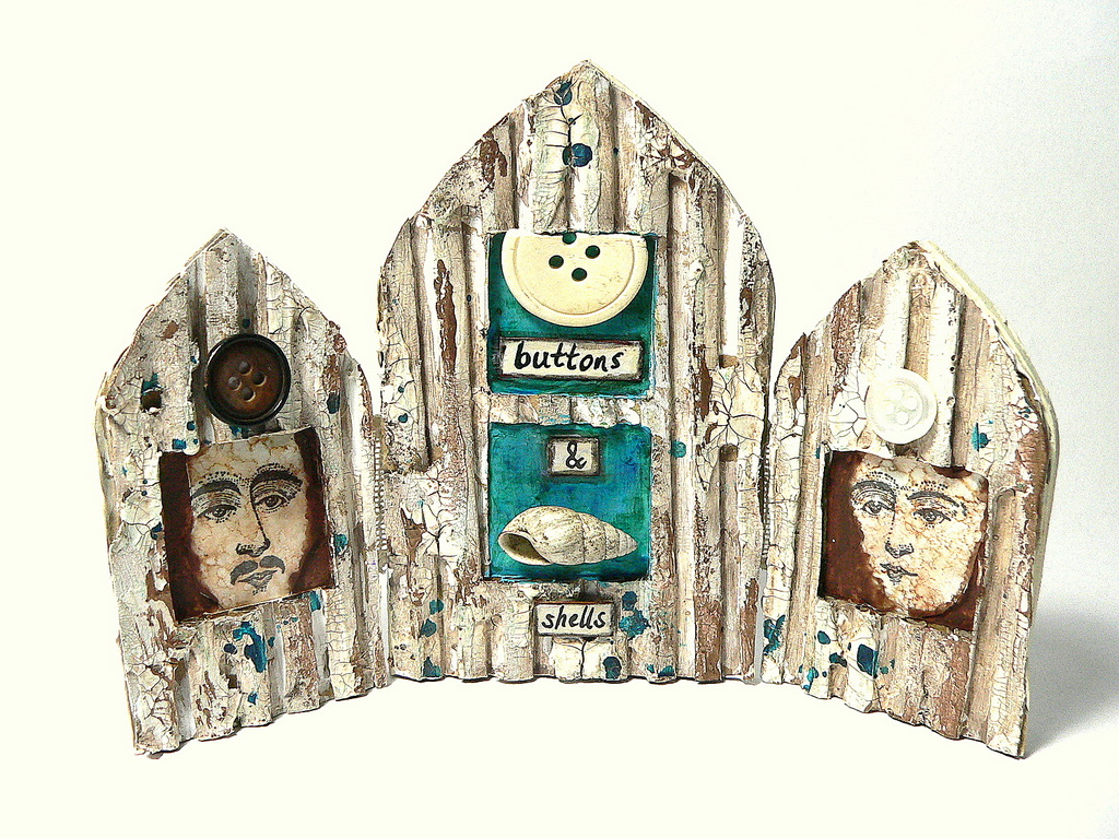
My tryptich is made from corrugated card which I treated with white Gesso, crackle media, metallic paints (DecoArt misters) and guilding wax. 

"Because he loved her he let her crack open his shell and push his most sensitive buttons" was the line that came to my mind when I looked at the spread out tiny treasures that I had collected for a possible use on my tryptich. 

Love is pretty much about trust and opening up and it is also about letting the partner not only see your more vulnerable sides but also bring out the best in you or even bring some hidden potential to the surface. But it needs a lot of trust and caring, right? 

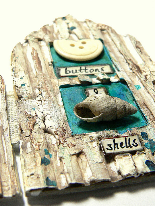
The broken button was part of a fleamarket find and I thought it shows perfectly how "sensitive" buttons might react to being pushed too hard. The tiny shell is one that can be found with our lakes in the Austrian Salzkammergut and I have been collecting them since I was a child. Now my son is the one who snorkels and collects those tiny treasures. ;)

(click images for larger view)


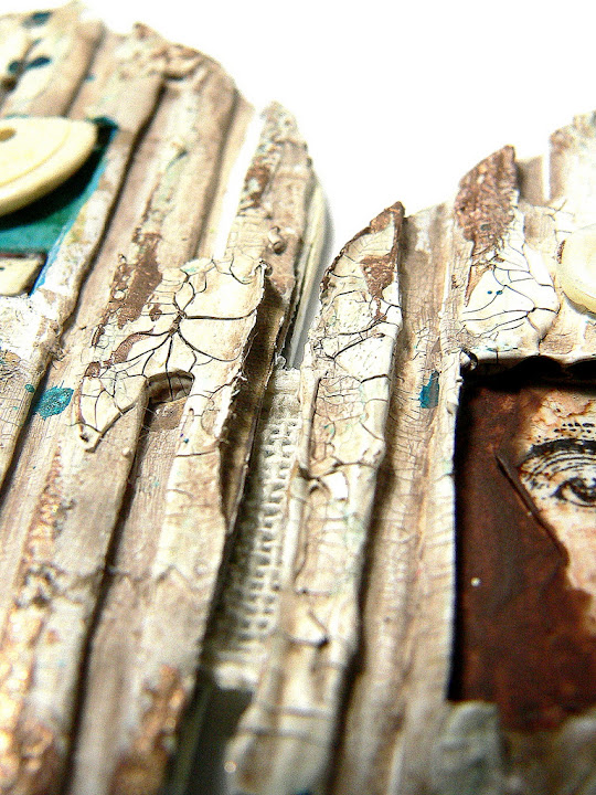
The three panels are hinged together by a piece of rough ribbon that was glued between the front and back panels of each section. I love to use fabric (especially linen) as hinges as they are flexible and soft at the same time. 


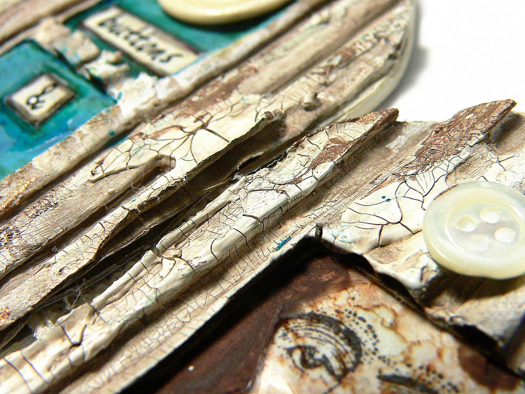
I first gave my die cut corrugated card panels (with the openings already cut into them) a heavy coat of white Gesso. Once that had dried I added some white DecoArt Crackle Paste with a palette knife and a brush and let that dry naturally (and thoroughly). Then I covered the whole surface with DecoArt Raw Umber Antiquing Cream and let that dry before I wiped off the excess with a baby wipe. I love how weathered the result looks! 


The faces were stamped onto acetate that was first treated with alcohol inks. I cut the acetate slightly larger than the window openings so I could simply glue them in place without visible traces of the glue. 

The background colours were painted in using a fine tip brush and DecoArt media fluid acrylics. For fixing my found objects to my tryptich I used matte DecoArt Decou-Page (my all time favourite when it comes to adding bulkier items to my projects). 


The winner of this month's challenge will be offered a guest designer spot for a future challenge - so why not join in and take your chance? I would love to see your interpretations of a tryptich! I also recommend you check out the makes of my fab teamies over at The Mirror Crack'd! I promise you will find some wonderful inspiration on how to approach this theme! ;)


Hugs and happy crafting,
Claudia
xxx


Sunday 3 May 2015

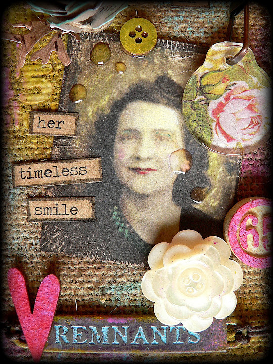
"The Magic in a Timeless Smile" - May Tag for Tim Holtz' "12 tags of 2015"

It seems like ages since I did my last tag, but yesterday, when I saw Tim's actual May tag for his 12 tags of 2015 I was so inspired that I had to directly head off to my crafting desk and get out all my thoroughly hoarded Tim Holtz stuff to involve in several hours of happily messing and creating with Distress paints, modelling paste and stencils, burlap, loads of idea-ology and other treasures from my stash.

And this is the result which I am quite happy with:


As I don't have most of the new stuff Tim uses on his May tag, I had to improvise with some of the older idea-ology bits 'n pieces, which I think still look as intriguing as ever as they are timeless as is the smile of the lovely lady from the photograph ;)

Using white modelling paste and one of Tim's fab stencils I added some texture to the top left corner of my tag. Once that was dry I gave the whole tag  and stencilled areas a rather rough treatment with various Distress paints and water from the spray bottle.


The edges of the tag were darkened using my "frayed burlap" Distress marker while the tag was still wet. That way the paint from the marker got soaked right in and I got a smudged, softer outline.


I created a "rose-y" pendant for my swivel clasp using a sheet from the lovely "Wallflower" paper stash and an idea-ology fragment. As I don't have the new Sizzix florals dies Tim uses on his tag, I wanted to at least incorporate some roses in a way.

To make the game piece match the colour scheme of my tag I painted it with Distress paint "picked raspberry". The other tones I used on my tag (mainly for adding colour to the burlap and stencilled texture) were "mustard seed", "broken china" and peeled paint". I also used them to paint my little wooden button, arrow and heart. 


 The word band was painted the same way and I used broken china Distress paint to make the letters pop out and also repeat the colour from the woman's dress and eye shadow and also the paper rose (which I made using the TH "Tattered pinecone" Sizzix die).


The adorable vintage flower button is an older idea-ology piece too (and I am happy it finally found its perfect home).

The word band was fixed to the tag using a thin leather cord that is glued in place at the back of the tag.


For a finish I glued some creamy white quillings to the bottom of the tag and added a  (previously distressed) ribbon of the same colour to its top. The repetition of that colour helped blend in the accoutrements flower button and the woman's face. And it also draws more attention to the woman's face as it repeats the skin tone.


Repeating shapes and colours you use with your project (in variations of shape and amount) in different spots always helps "fuse" all your elements to a greater "whole" and "keep them in place".


The photograph was coloured with Distress markers the way Tim describes in his post. I sanded and scratched the edges with the TH distressing tool before I glued all my elements and the chit chat stickers (which I blended in with Distress markers) to their advised spots. For a finishing touch I added some drops of DecoArt Liquid Glass for dew drops (which were meant to emphasize the flowery style of the tag). I saw and totally admired that with some of the wonderful creations from my lovely and awesomely talented friend Laura from Laurart and decided to "borrow" that brilliant idea from her. (I am afraid one can guess this was my first attempt....she does them so much better and so beautifully...lol).


I had a great time playing around with embellishments, paints, composition and highly textural stuff! And I really wanted to put her adorable smile in the spotlight (and I hope I succeeded)!

Hugs and happy crafting,
Claudia xxx 

http://timholtz.com/category/12-tags-of-2015/