Monday 28 May 2018

Happiness Comes in Waves, Doesn't it?

Sometimes nature can be overwhelming in its beauty. We all know moments like these, when happiness washes over us like a warm wave - simply because we are touched by nature's wonders. Right now the fields surrounding my home are covered over and over with red poppies - a sight that fills me with awe for these tender yet strong flowers.


The time frame for this special sight is quite narrow - which only makes me treasure this special time of year even more. A sea of red - suddenly there and gone in only a few days!

I needed to capture my feel of amazement (or at least try to do so). If you want to find out how I did it and how the finished project looks, simply hop over to the Calico Craft Parts Blog. I would love to see you over there!

Hugs and happy crafting!
Claudia
xxx


Thursday 24 May 2018

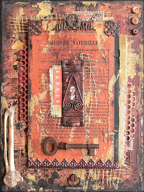
Skeleton Key - a Mixed Media Assemblage with DecoArt media

Hi, servus and welcome to a short post today, in which I would like to invite you over to the DecoArt Mixed Media Blog, where my latest DT make has just gone live.

I love collecting ephemera and found objects of all kinds. Beautiful pages from old dictionaries make fantastic backgrounds, but also offer beautiful vintage words to use in your art. Assemblage art is the perfect way to use some of your treasures and turn them into a piece of art that will beautifully display them and give them new meaning. And with the aid of one or the other DecoArt media product you can fuse all your treasures into one piece of assemblage art that tells stories of beauty and decay.

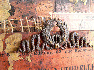
Some of you may remember that I have shared this detail shot on facebook (and maybe instagram too) a while ago...


...now I can finally show you the finished project:


To find out how I did it and which media I used simply click HERE to get taken to the DecoArt Mixed Media Blog post. Hope to see you over there!

Hugs and happy crafting!
Claudia
xxx


Wednesday 16 May 2018

Guy Style at Emerald Creek Dares

Hi, servus and thanks for stopping by!
It is time again for me to share my DT project for Emerald Creek Dares and this month's challenge theme is "Guy Style" - which is totally up my street!

When I hear guy or male style, I think about metal, grunge, rusty and industrial style stuff. Perfect for using some of my all time favourite embossing powders from the amazing Emerald Creek range!


I have used Emerald Creek embossing powders Hammered Metal, Burnt Copper Leaves, Ultra Thick Clear Gloss and Doubloon Gold alongside Baked Textures Ancient Amber, Vintage Beeswax and Rocky Road on this tag.


As I knew I was going to give the tag some rough treatments with loads of collaged on and scraped on layers, I decided to use one of the Calico Craft Parts MDF tags as a substrate to work on.
I also took the opportunity to use my newly bought Pete Hughes Circle Mask die from Sizzix alongside some of Seth Apter's fab Spellbinders dies.


Burnt Copper Leaves, Ancient Amber Baked Texture and Hammered Metal were used to heat emboss my first die cuts. I also used a left over die cut that had been heat embossed with Doubloon Gold.


The Hammered Metal "dots" on my tag are actually the cut outs from Pete Hughe's Circle Mask die ;)


Then I rummaged my box with left over die cuts from previous projects and found an old die cut (done with one of Seth Apter's fabulous dies) that I wanted to give more dimension to. So I heat embossed that one with two layers of the Ultra Thick Clear Gloss Enamel.


Vintage Beeswax Baked Texture is perfect to tone in any chipboards like this Tim Holtz paper doll that I wanted to have a more brownish tint instead of the original greyish one.


The MDF tag was covered with an old dictionary page that I toned down with tea dye Distress stain.


Then I scraped on some Fresco Finish Paper Artsy paints using a palette knife.


Black soot Distress Crayon was used to darken the tag's edges.


Rocky Road Baked Texture was added here and there for additional texture and patterns. To do so I dabbed some embossing ink from my dabber onto my craft sheet, picked that up with a palette knife and randomly scraped that across the tag before I sprinkled the embossing powder on.


Some Tim Holtz stencils and black archival stamping ink were used to add additional patterns.


As the background was way too noisy at that stage, I decided to tone everything down with a coat of Titanium white DecoArt media Antiquing cream.


Once the Antiquing Cream had dried, I used a soft damp cloth to wipe it back until I was content with the look of my background.


The heat embossed elements, some word stickers and my paper doll were glued in place using matte Decou-Page. I also added some doodling and shading with a white gel pen and a black aquarellable pencil.


I finished the tag off by stamping on some stitch patterns around the edges and adding a clip on top.

The actual Dare at Emerald Creek Dares is still open and by playing along you get eligible to win a


to spend at the online store! So don't miss the chance and show us your "Guy Style" projects!

Hugs and happy crafting!
Claudia
xxx


Tuesday 15 May 2018

Fragile Glass ATC for SanDee&amelie's Steampunk Challenges' Mid Month Reminder

Hi, servus and thanks so much for stopping by again! At the moment posts on my blog seem to almost collide (while at other times there's no post for at least a whole week) due to several DT projects and posting dates being only a day apart.

This is my latest steampunk ATC for our May challenge over at SanDee&amelie's Steampunk Challenges and as you may have already noticed I love doing ATCs at the moment - especially steampunk themed ones (like this one HERE or these HERE).


Being on the DecoArt Mixed Media design team, I have recently received a surprise parcel containing the new DecoArt pouring medium to experiment with (see this post HERE). One of the results from the experimenting session was this background paper that I created by simply pulling a monoprint from the messy sheet that I used to cover up my work desk while pouring the paints onto whatever I managed to lay hands on.

As I had some Calico Craft Parts ATC wood blanks on my table (stored in my new and much loved Calico Craft Parts container HERE) I played around with some of the frames, looking for a beautiful image section, and thought this particular one was a perfect match...


I used DecoArt matte Decou-Page to glue the ATC's back panel behind the chosen section (I used my desk lamp and held the paper up against the light to see where I was placing the panel). Once the glue had dried I cut off the excess paper and sealed the edges and top with more Decou-Page.


The ATC frame was painted using DecoArt media fluid acrylics Yellow Iron Oxide, English Red Oxide and Yellow Oxide. I mixed the paints wet on wet on the frame and also added some sprinkles to the background. The background was toned in with a wash of Yellow Oxide.


Then I mixed some white DecoArt media Crackle Paste with English Red Oxide and Yellow Iron Oxide and scraped that onto the frame and background.


Once the crackling process was finished I toned everything down with a wash of Raw Umber.


As I didn't want to cover up the beautiful background, I decided to use rub ons (this one is from a Tim Holtz rub on set). The tiny bottle was wrapped with rusty wire and glued in place with matte Decou-Page.


A watered down mix of Carbon Black and Raw Umber DecoArt media Antiquing Creams helped tone down and age the whole design even more. I especially worked that mix into the spaces and crevices from the ATC frame and crackled areas.


Once all was dry I added touches of DecoArt "Gold Rush" Metallic Lustre with my fingertip to highlight the textural areas from the scraped on Crackle Paste.


Done!


A Steampunk Message in a Bottle ATC!

Some close ups:


I hope you like it and I would love to see you join in our challenge! There's still time until the end of the month to play along! Maybe you will make our Top5 or even win one of our two give-aways! Don't miss the chance! 

HERE's the link to our challenge blog (or simply click on the badge to get taken to the actual challenge). And you will love what my teamies have created for your inspiration! 

Hugs and happy crafting!
Claudia
xxx


Monday 14 May 2018

What's Wildly and Wonderfully Wonky and Weird?

Find out by hopping over to the Calico Craft Parts Blog, where I am sharing my bi-weekly inspirational Monday project. ;)


The sneaky peek picture already gives away part of the answer to my riddle. To check out the whole project simply click HERE. I hope to see you over there soon!

Have a good start into the week! 
Claudia
xxx


Saturday 12 May 2018

Experimenting with DecoArt's New Pouring Medium

Hi, servus and welcome to an "experimental post" today!

Being on the DecoArt Mixed Media design team I got a sample of the new DecoArt pouring medium to play with and as I had so much fun and have tried several techniques I decided to do a short write up and share my experiences with it so far.

First of all let me tell you that it really is such great fun to play with - but also takes patience afterwards as the drying process can take up to two days - depending on how thick the layer of poured on paints is and on weather and climate of course.
Even if the top coat has already turned into a dry to the touch skin the paint underneath still is wet and liquid and if you touch your project too soon the top skin will tear and the spilling paint from underneath will ruin your design! So fun first - patience after! No heat drying - unless you want to create a kind of crackled look (which will be shown later in the post).


For starters I decided to experiment with DecoArt Americana paints as suggested in the leaflet that came with the pouring medium and top coat. Note that other paints from DecoArt will need a different mixing ratio (given in the directions on the containter and in the leaflet). For starters I picked the ones I had the largest containers of - black and white. I added Green Mist to have a third colour.

The image shows the plastic cups with one part pouring medium and one part Americana paints added (having eyeballed the amounts of paint and medium added to the cups) - before I stirred the mixes with Popsicle sticks.


These are the results I got after I had used up all of the paint from the cups - you see a little goes a long way (at least if you do not just use the paints for pouring) !


Very important: don't forget to cover up your work desk and yourself. Pouring paints is a very VERY messy process! I have used a large sheet of paper for the desk (and an apron for myself) which did the job pretty well.


1st technique: 

With my first try I followed the suggestion from the leaflet that came with the pouring medium and pouring top coat - the "Flip Cup Technique". It suggests you pour a bit of the different mixes one after the other in one extra cup, then place your canvas on top of this cup and flip both over. When you lift the cup the mix from inside will spread and create lovely random colour mixes, patterns and effects. I held the heavy greyboard panel (which is from Calico Craft Parts) at a tilted angle so the paints would run properly. I also twisted it so the running paints would change directions. I sprayed on some water here and there to speed up the running, which makes the paints more liquid so they start running faster than other areas and also on top of these -which creates a beautiful additional effect.


Areas with sprayed on water are at the left and bottom right. Pure poured on paint in the middle.
I put the panel to the side and let it dry a bit.

Then I went back in with some sprinkles of red DecoArt media Mister. I also sprinkled on drops of water.


The paint fro the Mister mixed beautifully with the poured on paints and created additional patterns that added to the design just beautifully!

The dry piece:


2nd technique: 

My next try was done on a small canvas. This time I poured one paint directly from the cup into the other and always started in the very centre of the previously poured on area. Then I took a skewer and dragged the paints into each other creating feather-y patterns.
As I did not tilt the canvas the paints stayed in the centre and formed a very thick layer (which actually took a whole day to dry on my balcony - where it has about 26 degrees Celsius at the moment).

For a bit of colour contrast, I added a single drop of red from the media Mister. That looked good at the beginning but started to spread less beautifully during the drying process (obviously from the different media acting differently during drying time) - so I would recommend mixing an Americana red with a bit of pouring medium instead to create this effect.


3rd technique: 

At that stage I realised I had some beautiful paint mixes on my desk cover sheet - so I dipped some white cardboard gaming tile blanks into the left overs in the way of a monoprint and put these to the side as well.


These are the four tiles I did - waiting to be used in a future project.


I also dipped a second small canvas into the left overs from the poured on paints and generously spritzed it with water before I tilted it. I used a small glass bowl to keep the canvas in its tilted position.


4th technique: 


I poured the paint mixes directly onto my desk cover sheet, creating drip lines, circles and small puddles and then pressed another greyboard tile onto that mix and rubbed gently to make sure all areas got in contact with the paints. When lifting it off I found I had created these beautiful patterns that remind me of marbled papers. I let that dry naturally as well and then sprinkled on some red from the media Mister for a bit of colour contrast.


5th technique (the "don't waste precious paint-technique"):

This is how the desk cover sheet looked afterwards - still loads of paint to use up, so I pulled a monoprint using a sheet of cheap copy paper.


I have used this one on a project that will go live on my blog on Tuesday.


Drying with the heat tool:

leads to crackles. The more water you have added during the process, the more cracks you will get.


You can see the especially with the white areas on the small left canvas where I had added a lot of water and also on the right panel in those areas where I had sprayed on a bit of water.


I like the additional texture that adds, but if you don't, I recommend you let your pieces dry naturally. The texture will also become "invisible" once you add DecoArt's "clear pouring Topcoat" (which I haven't done so far as I am saving that up for now - planning on more colourful pieces on different substrates).

Once more all the pieces I got from using up the content of the three small plastic cups:


For a larger poured canvas you would definitely need to use more mixed paint and larger cups than I did, but if you like to dip and monoprint too you can combine these techniques in a single session to get different pieces with different looks and effects - without having too much paint waste. Experiment to find out which mixing ratios work best for you - the suggestions from the container and leaflet are rather a starting point than something you have to strictly cling to. And most of all: HAVE FUN!

Hugs and happy crafting!
Claudia
xxx