Monday 25 August 2014

Sneak Peek - Sponsor Spotlight at Our Creative Corner

Servus and welcome to my own little creative corner in Vienna, dear friends, true readers and followers old and especially anew!

It is my turn over at Our Creative Corner today to showcase a stamp set from this month's sponsor Crafty Individuals! You will find yummy texture, a load of pictures and a detailed stepxstep as well over there. Just click HERE to get to Our Creative Corner and my post.

And if this wasn't already convincing enough I am allowed to share a little sneek peak with you... ;)


Curious now? Well, I hope so! Looking forward to seeing you over at Our Creative Corner!

Hugs and happy crafting,
Claudia xx

Friday 15 August 2014

Only Some Lab Geeks?

Time for Team B from SanDee&amelie's Steampunk Challenges to inspire you and remind you of our actual challenge "In the Laboratory"!

Being one of the busy Team B bees I have created a tiny steampunk diptych for you ;)


I used some papers from the "Laboratoire" and "French Industrial" Tim Holtz paper stashes and his Sizzix Alterations "Framed Arch" die.

And even though it isn't a tag, I dare enter this make to the August "challenge" over at Tim Holtz' fabulous 12 tags of 2014. I dare so simply because Tim says

"...so whether you’re obsessed with distress, or clean and simple is your thing, perhaps your happy place is bright colors, heck maybe even glitter is your sparkly obsession, this month i challenge you to create showcasing your own creative muse."

This reminded me of my beginnings - when I stumbled upon Tim Holtz, crafty blogland and Distress inks and the magic that can be done using them....so I decided to go back to the roots and enjoy messing around with Distress! It really still is what I love most - wrinkle free distress technique, drip them over patterned papers, create layers with TH papers scraps and with inks! Sometimes I think that there are so many media still to explore that I forget about the ones I enjoy working with the most. So Tim's challenge was a very welcome reminder for me!

The Tim Holtz washi tapes (especially the one with the chemical elements) were absolutely perfect for this job too! Also the two "lab geek" portraits were taken from one of the Tim Holtz paper stashes.I always love to give the people from Tim's papers "identities" ;)

So consider this my take on the August tag ;) (I hope it  counts).


The papers were heavily treated with various Distress inks and stains, some spray colours which I let run down or sprinkled on, some washi tape and some stamping with texture stamps and my beloved 3rdEye light bulb stamps!


The clock key and the tiny vial holding watch parts were in the lovely watchmakers cabinet I got for X-mas last year.


Why don't you hop over to our challenge blog and see what the rest of Team B have prepared for you. And of course you shouldn't miss Team A's creations either! There are loads of "Laboratoire-Goodness" waiting for you!

And I can't wait to see yours! ;)


Looking forward to meet you at the challenge! ;)


Hugs and happy crafting,

Claudia x


I also enter this project to: 

Simon Says' Monday Challenge - Scratched Up ( I used sandpaper to sand down the edges of the finished two arch panels before I glued them to the black folded background arches)

The Artistic Stamper's Summer Challenge - Anything Goes  


Tuesday 12 August 2014

Crack Those Flowers! (a DecoArt Tutorial)

Yes, you are right....It really was about time that I shared a new DecoArt tutorial with you....

...so here we go:

some of you may remember the fantastic blog hop the International DecoArt Design Team were invited to by Stampendous some weeks ago. We were lucky to get some of Stampendous' fabulous Fran-tage embossing powders (one of my favourites) and I used some of them on this project alongside the wonderful new media line from DecoArt that has a lot of fantastic new media for you to conquer new and yet unknown creative territory with!


I created a lot of crackle and heat embossed goodness on this one and hope you will have fun creating your own ;)


Materials I used:


- DecoArt media Antiquing Creme "Carbon Black"
- DecoArt media Fluid Acrylics "Primary Cyan" and "Interference Gold"
- DecoArt Americana "Zinc"
- DecoArt Traditions "Raw Umber"
- DecoArt media Crackle Glaze
- DecoArt Weathered Wood Crackle Medium
- DecoArt Dazzling Metallics "Worn Penny"
- DecoArt matte Decou-Page

- a small wooden box
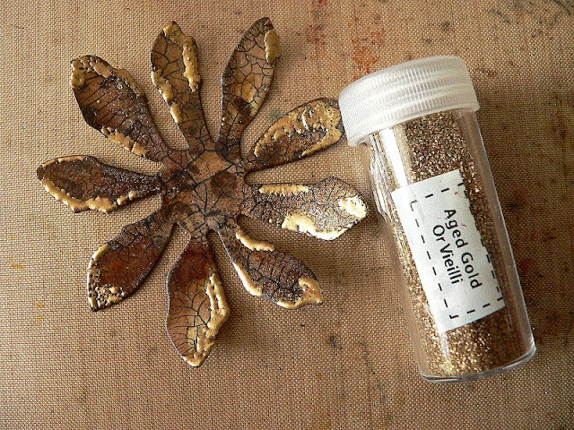
- Stampendous Fran-Tage embossing enamels "Aged Teal" and "Aged Gold"
- embossing pen
- heat tool
- Ranger Distress ink "Walnut Stain"
- Idea-Ology "Linen Ribbon"
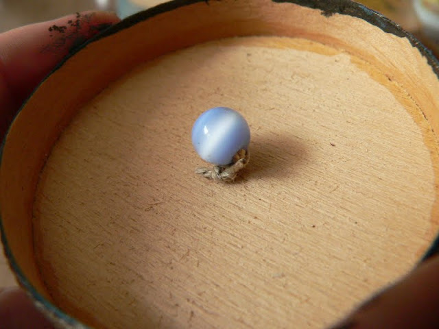
- two glass beads
- thick thread
- hand drill
- soft brush, baby wipes, blending tool, palette
- flower die (I used the Sizzix Tattered Florals Alterations die)
- die cutting machine


Steps 1 and 2

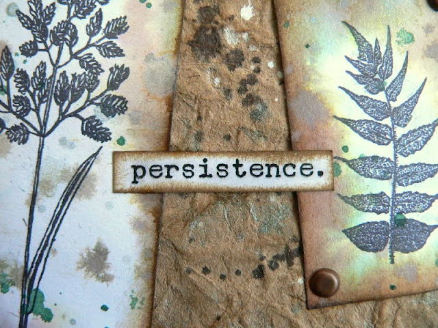
I used some left overs from various backgrounds I did with background stamps and Distress inks to diecut my flowers from, but you can use any background left overs you like - as long as the aren't too detailed in texture, so the fine crackle we will add later will show really well!


I blended the edges with DI "Walnut stain". Then I took a soft brush and gently applied a layer of matte DecoArt Decou-Page as a sealant.


Step 3 


Once the Decou-Page had dried I brushed on a coat of DecoArt media Crackle Glaze and let dry naturally. The Crackle Glaze is self levelling and produces very tiny cracks when applied rather thin and larger ones where the coat is thicker.


You can see the cracks in the image above - but we still have to make them more visible ;)


Step 4


To highlight the cracks I rubbed some Carbon Black DecoArt media Antiquing Creme into them and wiped off the excess with a baby wipe.


Now that makes a difference, doesn't it? 


Step 5


I gave my tiny wooden box a coat of Raw Umber DecoArt Traditions and let dry. 


Step 6 


While the box sat aside to dry I heat embossed some of my flowers' edges with Fran-Tage embossing powders and enamels.


Step 7


The smallest flower received a treatment with DecoArt media fluid acrylics "Interference Gold".


 I love that stuff as it gives a subtle sheen to your make that is only visible when the light hits right.


Can you spot the difference? 
Looks awesome, doesn't it? 


Step 8


I painted the backsides of my flowers with DecoArt Dazzling Metallics "Worn Penny"


Step 9


I applied a heavy coat of DecoArt Weathered Wood Crackle Medium to my painted box and let touch dry. 


Once the Weathered Wood had dried to the touch I painted my box with a mix of DecoArt Americana "Zinc" and DecoArt media Fluid acrylics "Primary Cyan" (to match the colour of the embossing enamel).


And when that had dried I brushed on some more "Interference Gold".


I love how the colours from the Interference range still let the original base coat shine through but show and shine when looked at from the right angle.


 Step 10 


I painted a piece of linen ribbon with DecoArt media "Interference Gold" and glued it to the lid using matte DecoArt Decou-Page.


Step 11


To fix the assembled flower to the lid of the box I used a small drill to prepare the hole.


The flower leaves got punched too and a piece of rough thread was threaded through them from the top together with a glass bead of matching colour as the flower's center.


To keep the flower in place I threaded another bead from below and fixed the thread tightly with two knots.


Done!


Some more close-ups so you can see all of the crackle and embossed goodness:


I hope you liked what you saw and that my tutorial manages to encourage some of you to give the fantastic new DecoArt media line a try!!!!


Hugs and happy crafting,

Claudia xxx


Friday 1 August 2014

Summertime at Our Creative Corner

Hello, happy holidays and welcome back to the start of the August challenge at Our Creative Corner!

Summertime

is our theme this month and your lovely host for this challenge, Laura from Laurart, says:

"What sparks your imagination when you think of the word 'Summertime'? Travel to far away exotic destinations, buckets and spades, sand dunes and sparkling sea? Does summer bring to mind delicate flowers in a hazy garden or bright vivid tones of a warm sunset? Perhaps just the use of vivid colours evokes a summery mood....or do pastel shades have more of a summer look for you? 
Whatever your interpretation of 'Summertime' is we would love to see your creations shared with us at Our Creative Corner!"


Well, to me summertime means to spend a wonderful time at a lake or at the sea - walking barefoot, collecting shells, sitting on piers, kayaking, swimming, watching the sun paint glittering white and golden crowns on waves and relaxing to the sound they make when they gently crush upon the shore.


Sadly Austria is nowhere close to the sea (but we have a lot of wonderful swimming lakes and the Alps to hike and beautiful forests and such), but when I dream myself away to a lovely beach I can almost feel the breeze that brings the ocean's typical smell and the sand between my toes, I can hear the seagulls' cries and imagine myself collecting shells while walking endless sunny beaches.


The two shells I used on my card were souvenirs from my stay at Paradise Island (in the Carribean), which was wonderful but way too short.


I love to encorporate texture with my creations so I decided to add a "fisher net" too. And the lovely Vilda lighthouse stamp was a must! The background was made from a scrap I made from card using the Wrinkle Free Distress technique and some of my favourite "blues" from the DI range.


I hope you like my card (which is a rather uncommon sight with my blog, I know) and hop over to Our Creative Corner to find out what the team have in store for your inspiration!

We also have a prize sponsor and it is Crafty Individuals this month! So join in our challenge and get eligible to win some of their fab stuff!

Happy holidays to you all!
Claudia x