Friday, 16 October 2015

Sneaky Peek - New DecoArt Mixed Media Tutorial


Servus!

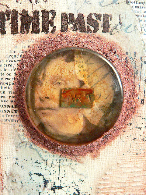
Just a short sneak peek post today that is meant to invite you over to the DecoArt Mixed Media Blog where I have a new tutorial in store for you that does not only show you how to recycle old blister packages (the ones your embellishments come in for example) but also how to create a textural and industrial looking wall hanging.


http://decoart.com/mixedmediablog/project/347

Hope to see you over there!
Have a lovely, crafty weekend!
Claudia 
xxx


Thursday, 15 October 2015

Top Hats and Moustaches...and a little Halloween

Servus and welcome to my mid-month reminder project for SanDee&amelie's Steampunk Challenges!

Our theme this month is 

Top Hats and Moustaches


and I think both are essential elements with steampunk as they recall the miraculous era of Victorian gentlemen and engineers....

I love browsing flea market stands for vintage photographs and I think all men looked so distinguished back then - simply because of their impressive moustaches and the suits.


But then it is Halloween season at the moment...so I am afraid I got once more carried away and there's no moustache to find with my project for our steampunk challenge but at least a top hat...phew!


And honestly...a moustache would have covered up the beautiful teeth, right?
So here he is - my boney gentleman with his top hat.

As I had no top hat stamp for the project I had in mind, I made my grinning chap using a Paper Artsy skull stamp and combining it with a scanned, put to correct size and printed out top hat image from this wonderful book...

http://www.amazon.de/Victorian-Goods-Merchandise-Illustrations-Pictorial-ebook/dp/B008TVLTTS/ref=tmm_kin_swatch_0?_encoding=UTF8&qid=&sr=

...which I found at amazon.com.

But first I created a background in my art journal by collaging on some scraps of designer papers and torn book pages.


Next I scraped on some black acrylic paint with a small palette knife. 


That was followed by scraped on medium grey,...


 ...light grey and titan buff...


..and then I went in with a black and red DecoArt media Mister and created some dripping lines to make it all look more Halloween-ish for Mr. Bonehead-without-moustache.


For more detail I also added some drops and splatters of black and white - directly from the Mister bottle.


My stamped skull and the printed out and fussy cut hat were fixed to the page using DecoArt media Matte Medium. Mr. Bonehead got a monocle (made from a chipboard gear I had coated with red DecoArt Metallic Lustre and fixed to a small chain) and some black and white thread was "thrown" on the page for more interest (or chaos).


So this is my post for today. Maybe a bit too much blood...but hey - Halloween is still on my plate and I enjoy this season so much. Hope you do too - and maybe also join in our challenge at SanDee&amelie's Steampunk Challenges!


Booo!...erm...
Hope to see you over there!
Hugs and happy crafting,
Claudia 
xxx


Saturday, 10 October 2015

Autumnal Forest Scene - How to Get the Most out of Your Dies and Stencils

Hi and servus and welcome back to another little scene I have created using dies and stencils and today I have decided to share a full and detailed how-to with you as sometimes the results don't show all the necessary steps there are to professional layering with masks and stencils.

You have already seen me recently use dies to create masks and stencils (or for drawings) for the projects over HERE and HERE but this time I have taken the technique a bit further to create this autumnal scenery in my art journal:


You know - the Vienna Woods really look like this in autumn...especially close to sundown and with all the red leaves lying on the ground.

The forest and the fox are both done using masks and stencils (created from the fabulous new Tim Holtz "Birch Trees" Thinlits die and part of an X-Cut Create a Scene die set).


Using two stencils in one go provides a lot of new opportunities for creating a lot of depth - on my art journal page I used the lovely Dreamweavers stencil alongside my self-cut "stencil" done with the Birch Trees die (using some heavier white card for more rigidity).


The image above shows the Birch Trees "paper stencil" to the right - after use together with the metal Dreamweavers forest stencil. The effect on the page already looks pretty cool, but I wanted to take this all even further and add more depth by adding colour.

But let's start with the start - the preparation of the journal page!


With a worn wide bristle brush I added some brush strokes in medium white and two different browns - making sure the paint was rather dry on the brush so the strokes from the bristles would be visible. I created horizontal brush stroke lines as these would later imitate the bark texture of the birch trees.

When that was dry I placed the die cut birch trees (paper) stencil underneath the forest stencil and fixed both to my journal page with masking tape so they would stay in place.


 Then I stippled on some dark grey acrylic paint with a stipple brush. After removing the stencils the page looked like this (with the wider trees in the foreground and the thin ones in the back - but still rather "flat"):


You could of course leave that forest as it is, as it already looks quite good, but I wanted to add more colour and create the illusion of depth.

So I placed the birch tree stencil (the one I cut from paper using the die) once more on my page - making sure the shapes of the birch trees all lined up again - and stippled on some transparent acrylic paint (in my case I used Quinacridone Burnt Orange). The transparency of the paint still lets some of the texture underneath show through.


 And this is how my page looked like afterwards:


You see that the stippled on orange paint also got into the spots where the bark of the birch trees was meant to have its typical dark spots...so I went in with a fine tip brush and "repainted" these with the dark grey I had used at the beginning.


That looked much better now:


Next I needed a bit of dimension....so I began shading in some light orange to one side of the trees' trunks. I did so by using a small flat brush and only little paint - most of which I first brushed on the other page of my journal to get an effect close to dry-brushing. It is important to always paint the same side of the trunks as the orange colour is meant to be the reflection of the sunlight (which emerges from one point mainly - so imagining the sun and her position as a lit light bulb often helps concentrate on where to add colour and where not)


Now I found that I needed a frame to help make clearer where the birch trees "ended". So I roughly painted one using black acrylic paint and a wide soft brush.


 Then I did some more shading - this time on the shady side of the tree trunks with some Burnt Sienna and my brush and for a finish with my "ground espresso" Distress marker (smudging the drawn lines with my fingertip as long as the ink was still wet).


At that point I had several ideas on what to do with my autumn forest painting so far:


I could have cut it out and used it on a card alongside some die cut sentiments for example, but I wanted to do some more painting...

...so I decided to add a fox to the scenery. I had a fox die from the lovely X-Cut Create a Scene "Woodland" die set (that I used HERE), so I used it to create another stencil.


And here's how to do the fox:
1. Stencil on some orange paint. Let dry.
2. Paint on the white spots (feet, tail, ears and mouth). Let dry.


3. Draw the nose, eyes and claws with a fine tip black china ink pen. 


Well, there it was...but the ground it stood on didn't fit at all - it simply wasn't a "ground" but only the end of the painting. So I took a very small fine tip brush and some black acrylic paint and painted some forest ground (like mushrooms, sticks, grass and such).


Now that looked so much better! 
And I was done. 


I hope you like my page and the how-to! AND I hope that you maybe even dare try this for yourselves! I would love you to share your sceneries done with this technique with me (maybe leave a link with the comments section?)! 

Dies are one of my favourite things to experiment with as they can be used in so many more ways than just the obvious ones (although I love the "obvious" ones too...lol).

Thanks for stopping by!
Hugs and happy crafting,
Claudia
xxx


Friday, 9 October 2015

Show Your Face - Grumpy Scientist

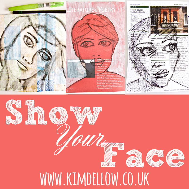
Just a short post today, sharing my "grumpy scientist" drawing with lovely Kim Dellow's "Show Your Face" community!


He was done freehand with a brush tip black Faber Castell PITT artist pen. I hope you like him. Well, not him exactly...but the drawing..lol.


If you haven't checked it out yet, just visit her blog to find out more and see loads of awesome artful faces and inspiration done by gifted bloggers!

http://www.kimdellow.co.uk/2015/10/watcha-facers-it-is-time-to-share-your.html


Hugs and have a lovely weekend!
xxx

Wednesday, 7 October 2015

12 tags of 2015 - October

What better is there to do on a cold, dark and rainy day like today than to craft away and join in Tim's 12 tags of 2015!

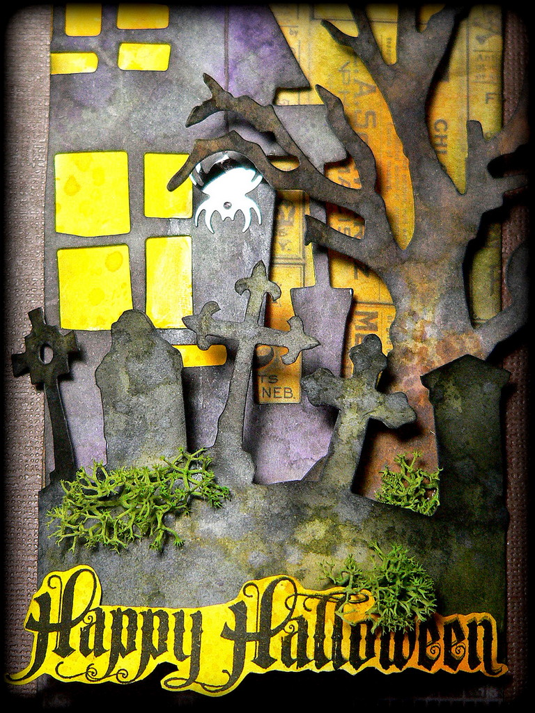
I loved his idea for the October tag right away and it took me some days to figure out how I could adapt it for the Halloween Tim dies I have in my stash - and here it is:


I used my favourite "Rickety House", "Branch Tree" and "Graveyard" dies to create this little scene and followed Tim's instructions on tinting the white cardboard for the single die cut parts closely. I have been using these dies quite a lot recently and in quite different ways (to create my own masks and stencils with them over HERE, to use them for my drawings over HERE and to use them with acrylic paints for layering and creating texture over HERE) as I like to get most out of my favourite craft supplies ;) 


Honestly I really enjoyed doing his "wrinkle-free-distress" technique again. My distress inks had sat in their storage box unused for way too long!!!

Even the lit area behind the windows was done this way and then glued behind the die cut house shape before I mounted it to the prepared tag with sticky foam pads.


To achieve as much dimension as possible I decided not only to fix my house and tree to the tag with several stacks of sticky foam pads but I also bent the graveyard so it would create a kind of "stage front".


For my stamped quote I used the rest of my previously wrinkle-free-distressed yellow background to repeat the colour of the windows which helps unify the elements used in a compositon.

I did the same with the lace ribbon at the bottom and the idea-ology linen ribbon I painted with Distress paint to make it match.


To make my scene a bit more lively I added a sequin spider and some moss to my tag.


When I was done with my tag my desk looked like it had been hit by a bomb -  an unmistakable sign that I had had a wonderful creative messy time at my craft desk!


I hope you like it! Thanks for stopping by and hugs and happy crafting! xxx