Friday, 15 January 2016

"la fée urbaine" - for our January Challenge at SanDee&amelie's Steampunk Challenges

Servus!

The first challenge over at SanDee&amelie's Steampunk Challenges this year is already in full swing!  Being member of team B I am sharing my January project for our "Anything Goes - Steampunk/Industrial" challenge with you today.


One of my (few but earnest) resolutions for the new year is to draw again (and more regularly) and also be brave and put my drawings out there for you to see (you see - I am still very shy when it comes to exposing myself in my personal art. It makes you more "real" as the artist behind the makes and more "readable" (which is good) - but therefore also more vulnerable at the same time as you are showing a piece of yourself.

The "fée urbaine" or "urban fairy" originates from one of my very first avatars (or pseudonyms) under which I started publishing my own poetry years ago - "asphaltfee" - which is German for "asphalt fairy". (and I still remember very well the loud beating of my anxious and excited heart when I hit the "publish" button for the first time in my very first poetry forum ;).

I believe that urban fairies exist - not as tiny fragile and magical creatures of course but as people like you and me who haven't forgotten how to "see the magic and poetry in ordinary day life and small things". As someone who can be fascinated by the working and pumping of steaming technology as well as by the sight of some dandelion breaking open the asphalt of the concrete desert of the city.


And if you have already thought that the hairstyle of my urban fairy looks a bit familiar this is no coincidence of course. I love nature's beauty and piece and quiet but I also love watching life in the city and detecting urban poetry when watching people and traces of life in general (in Vienna's coffee houses, markets, historical and modern buildings)...so, yes - that fairy looks a bit like (a younger and slimmer version of) me.

I have used some lovely dragonfly wings from Wycnanka, a Tando Mixed Media Board and some die cut gears which I got from lovely Rosie ages ago and have hoarded ever since (thank you, Rosie!). But today's post is especially meant to introduce to you the new (and one and only) prize sponsor of our steampunk challenge blog - DecoArt Media!


http://decoart.com/mixedmedia/


And this is the prize package I have been kindly allowed to put together for our lucky winners. As you can see I have chosen some of my favourite go-to colour tones and media for creating steampunk or industrial looking mixed media art - and I hope it will make a good starter pack for your new DecoArt- and steampunk/industrial art adventures too!


Of course I love to mix DecoArt products with the products from other brands that I have already in my stash - so today I want to put a special focus on some of my favourite DecoArt Media products and also show you how to incorporate them into your actual media stash!

First: DecoArt Media Antiquing Creams! A must-have if you want to tone down your projects for a more grungy feel (and still have the possibility to wipe it all off again if you aren't content with the look)!


This is how the gears looked before the treatment with "Carbon Black" Antiquing Cream:


Shiny and bright (which is the amazing effect of DecoArt's awesome "Dazzling Metallics" paints!!!) - and beautifully metallike! Of course you should also use them the shiny and blingy way...but I wanted a more worn look - so dabbing on some Antiquing Cream with my finger did the job perfectly.

Another fab mixed media product specialty from DecoArt's Media range are their Interference Paints! I used "Green" on my painted dragonfly...erm...fairy wings and you can see how it depends on the angle you look at them to see their ever changing effect! Perfect for moving objects like mobiles or foldable cards or ornaments...or for creating magical fairy bling that only shows when you look closely ;)


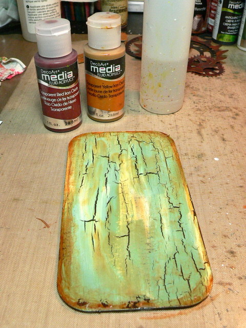
To prepare my background I first painted a thorough coat of Raw Umber heavy body acrylic onto my mixed media board and let that dry. Then I applied a generous coat of DecoArt Weathered Wood crackle medium and let that dry to the touch. Then I quickly and gently applied a thin coat of Americana acrylic paints "Green Mist" and "Light Buttermilk" (mixing them directly on the substrate) and let the Weathered Wood do its magic. 


 To create a visual frame (and to make it look a bit more rusty and worn) I applied some DecoArt Media fluid acrylics "Transparent Red Iron Oxide" and "Transparent Yellow Iron Oxide" around the edges and quickly misted everything with water to create a light wash and drip lines. But be careful not to add too much water - otherwise the top layer of Americana paints might come off!!!

While that was set aside to dry I started with a pencil sketch for my fairy. Once I was content with the sketch I used my light box and a a black super fine tip PITT Artist Pen to transfer the drawing to a clean sheet of heavier paper. As the inks in the Faber Castell PITT pens are permanent, you can paint over them later without smudging the lines.


If you are anxious about messing up your drawing when colouring it with watercolours or inks, just make a copy of your drawing first. You can work on the copy as well (if you have used heavier printer paper), but then you have to make sure the ink from the printer has dried completely!!!

Mix your inks on your craft sheet or palette as you go - be daring! Create new tones by adding new layers - this will create a lot of depth.


I then arranged my prepared cogs and gears and glued them to my background panel (using my favourite glue and sealant - matte DecoArt Decou-Page).


I printed out my words and blended the edges of the cut out word tile with Distress ink using a blending tool and archival black stamping ink. 


 Finally I added my fairy and the wings to the background and shaded the image and word tile in using a "ground espresso" Distress marker which I smuged with my fingertip while it was still wet.


Here are some close ups of the created effects and layers...


...and of course the invitation to hop over to SanDee&amelie's Steampunk Challenges to check out the creations of my fab team mates and find out about how to enter our challenge and maybe even make it to our Top5 or win some awesome DecoArt goodies!


Hope to see you over there (and playing along with us) soon! 

Hugs and happy crafting,
Claudia 
xxx


http://sandee-and-amelie.blogspot.co.at/

Saturday, 9 January 2016

We are on our way...

Please come and join us for the New adventure!


Servus and welcome to some exciting news today!
 Emerald Creek are demonstrating their new products and range at CHA! (and today's post over at the Dares blog also starts a new challenge you can join in of course).

http://blog.emeraldcreek.ca/2016/01/we-are-on-our-way.html


Among them are some lovely stamp sets from blogger and DT member Nicole Wright who will be launching the first in her own series of quarterly releases under Nicole Wright Designs with stamps to start and also some great dies coming... and we - the lucky DT - were given some of the stamps to create with...


...and to my great pleasure and delight they were Japanese themed stamp sets! (thank you, Nicole! ;): Fallen Blossom and Upstream

To learn more about them and to check out my talented DT members' creations hop over to Emerald Creek Dares!

I love Japanese art, culture and poetry, so I decided to combine stamping, art journalling and writing my own haiku on this special occasion!


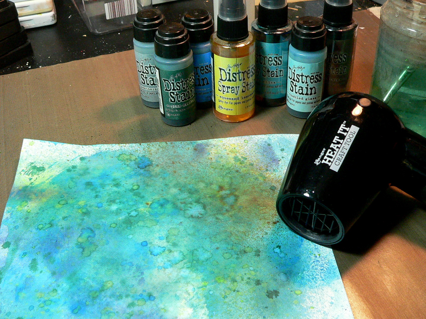
 On my Japan inspired journal page I used Distress inks only (ink pads, stains and spray stains) - but in a more painterly, mixed media way this time!

I hope you like this slightly different approach on using them. Distress inks were one of my very first products I bought when I started my stamping and blogging career and discovered crafty blogland and Tim Holtz' awesome grungy and vintage style and techniques and I still love using them - even though I have turned from pure stamping and distressing towards using more mixed media. But I would never want to be without my Distress products and I always enjoy going back and using those good old distress ink techniques alongside the younger mixed media products and techniques.


 For my page's background I cut some white card to size and treated it with the Tim Holtz "Wrinkle Free Distress" technique (one of my all time favourites as I just love the splattered patterns and randomness about it). You will find a the list of colour tones I used at the end of my post (and you can also see them in the photographs).

If you want a larger image just click on the photographs. 


I also used Distress stains and spray stains (alongside the Distress ink pads) by applying some of the paint to my craft sheet and loading a soft brush (with which I sprinkled on the inks). Especially the "squeezed lemonade" created some beautiful splatters as it mixed with the blues and thus gave me some shades of green - perfect for a pond's colour palette!


You can of course use any of the three forms of Distress ink products for each technique shown here and don't have to follow my list precisely. I combine my Distress products as I have them and in which form I have them and apply them to my craft sheet first to dip my brush into the little puddle of ink for painting.

To create a visual frame I inked the edges with "chipped sapphire" Distress ink, using a blending tool.


For a special effect (more on this later) I used some left over acetate from one of my Sizzix dies packages and applied Ranger Alcohol inks in various shades of blue. 


The koi and some of the cherry blossoms were stamped onto some heavy white printer paper in Ranger jet black archival ink and then painted using Distress stains and spray stains and a thin soft brush.


I fussy cut the cherry blossoms and the koi. The acetate was cut into wave-like swirly shapes.


I wanted to create several layers: working with the transparency of the alcohol ink treated acetate that would change the colours of the background underneath, and by adding a lily pad that was painted using Distress spray stains, water and a soft brush.


The first layer of my lily pad was done using the Wrinke Free Distress Technique. As you can see I didn't use any green, but mixed some "squeezed lemonade" and "tumbled glass" for starters:


Then I went in with some diluted "pine needles" Distress stain and water to paint the edges and the leaf's veins. The result looks like a watercolour painting, as the Distress inks react beautifully to water and each other.


The haiku was printed out, cut out, swiped through some "tattered rose" Distress stain on my craft sheet and then inked around the edges with "chipped sapphire" Distress ink after all the word tiles had dried.


The acetate waves were glued onto the background using Ranger Glossy Accents so none of the tiny glue dots would be visible. The lily pad was fixed to the page using two pieces of Ranger adhesive foam tape.


I love how the acetate waves change the colours of the koi and the water and create a lot of movement on my page!

Using the Distress inks, stains and spray stains to paint with them is great fun and helps create quick and spectacular watercolour effects! You can mix them on your sheet like any other kind of paint...so the possibilities for colour tones are almost endless!

Products used:
- Emerald Creek "Nicole Wright Design" stamp sets "Fallen Blossom" and "Upstream"
- Distress Inks: chipped sapphire, faded jeans, broken china, evergreen bough
- Disress Stains: tumbled glass, tattered rose, pine needle, weathered wood, salty ocean
- Distress Spray Stains: rusty hinge, red brick, squeezed lemonade, broken china, gathered twigs
- Ranger Glossy Accents
- Ranger Adhesive Foam Tape
- Ranger Alcohol Inks: Stream, Juniper, Sail Boat Blue
- Ranger Blending Tool
- heavy white card and printer paper
- clear acetate
- Ranger Heat Tool


And now its your turn, we want to see what you are making with your NEW Christmas presents, NEW purchases, NEW techniques, NEW CHA stuff even if you are one of the lucky few to have yours right away.

The challenge is open and awaits your wonderful projects! Hop over to Emerald Creek Dares by clicking on the image:

http://blog.emeraldcreek.ca/2016/01/we-are-on-our-way.html


Hugs and happy crafting,
Claudia 
xxx


Friday, 1 January 2016

A Mixed Media Necklace for Our Creative Corner

Servus and happy new year to you, my dear old, new and true readers! It is my special honour today to kick off 2016's challenge galore for Our Creative Corner!

I have learned my lesson with new years resolutions and have narrowed mine down to just one promise I am making to myself each Silvester: to be as gentle and kind with myself as possible (as dealing with a chronic illness often makes you feel that you just have to try harder, be less slack...and therefore less forgiving towards yourself - which most of the time leads to the exact opposite from what was intended: more frustration and more anger) and to make more time for pressure-free me-time....without any goals - except this one: to enjoy myself!

So OCC's January challenge asks you exactly that: to enjoy yourselves by creating within your comfort zones...maybe challenge yourselves a little too if that is something you enjoy...but no pressure, no given direction, no precise theme - just a lovely moodboard palette and image to spark your imagination:


http://ourcreativecorner6.blogspot.co.at/


If you hop over to Our Creative Corner you will find a wonderful bundle of very different inspirational pieces done by the Design Team! I love and adore them all!!! (and I will love and adore our players' pieces too! Of that I am sure ;)

When looking at the colour palette and image I immediately thought of using metal and patina tones...something with circles...which led to jump rings...which led to the idea of creating a necklace from self made wire links, metal stamped pendants and found objects (as I discovered that hammering wire and bending it into shape is something very relaxing for me).

And here it is:


(Ignore the pastel blue pins - these were used to hold the necklace in place). Except from the little key and the idea-ology safety pin all parts of the necklace are handmade (of which I really am quite proud I have to admit as this is a result of my very first steps at metalsmithing and creating beautiful links from wire).


I especially love this wire link that is made from silver coated copper wire and darkened with black patina after some metal stamping.


 The "Live" pendant was made from a flat brass disc which I stamped and domed lightly. For the green patina touch I added a bit of turquoise gilding paste.

If you want to learn how to create the paper beads with wire you will find a full tutorial over HERE. 


The box for my necklace was made from an emptied chocoloate box into which I inserted a cut to size corrugated card panel. It was covered with some Tim Holtz "Eclectic Elements" fabric that matches my necklace's design perfectly!

The outside of my box was covered with some "Madame Payraud" designer paper and inked around the edges with Ranger "Sepia" archival ink.


The challenge over at Our Creative Corner is open until January 28th. This month's prize sponsor is Creative Embellishments - so don't miss the chance to win a $25 voucher for their store!

http://creativeembellishments.com/


Hugs and happy crafting!
Claudia
xxx


http://ourcreativecorner6.blogspot.co.at/


Tuesday, 29 December 2015

This Year's Nativity Scene

A short post today to share the nativity scene I built this year.

 
As usual I did not paint the planned Alp landscape background (which is called "Hald" (from "heap") in Ebensee, from where this specific nativity scene tradition originates) this autumn and knowing that I very likely would not paint it for next Christmas (or the one after that) either (as landscape painting isn't up my alley at all) I had a sudden lightbulb moment born out of utter despair: I could use one of my photographs I have taken this summer when hiking the Krippenstein to take a look at the marvellous Dachstein glacier from there!!


The more I thought about doing this the better I liked this idea. It would kind of transfer a very old and loved tradition from centuries ago into the 21st century - a contemporary "interpretation" so to say! Yessss!


This is one of the images that made it into the finals...but in the end I decided to go for a background that looked more "close" to the scene with all the children, shepherds, animals and other characters ...


Of course I was too late with getting my printed photo-canvas in time so I could already have it for Christmas eve, but it arrived today and I am more than just pleased with how it turned out! Yay!


I will have to get a bigger base of course for the scene to match the size of the canvas...but that is a lot less "scary" than imagining myself painting a mountain landscape. But then it will always be a work-in-progress project as there will new characters and animals be added and maybe new pieces of bark, new rocks,... just as it is meant to be.

Wishes!
Claudia
xxx