Sunday, 6 September 2015

Have a Frightfully Spooky Halloween! - a DecoArt Mixed Media Halloween Tutorial

Servus and welcome to my first Halloween project (including a detailed mixed media tutorial) for this year!

This project was mainly created for the first and fab Mixed Media Halloween "Haunts" challenge hosted by DecoArt Mixed Media, featuring a lot of awesome projects by the DT and offering two huge prize packages for two winners who will be chosen from all the entries by Mr. Skinner himself! So don't miss it!

http://www.decoart.com/mixedmediablog/article/135/mixed_media_haunts_challenge


So for today I want to show you how to do some layering with some of my all time favourite Halloween die cuts and use them alongside some of the DecoArt media products and paints to create a lot of depth and spooky-ness.


For my project I used:

- a 6 1/2 x 6 1/2 inches (17x17cm) square piece of left over heavy cardboard
- Sizzix Alterations dies: Rickety House, (On the Edge die) Graveyard, Bewitching Hour (the bat only)
- Spellbinders Shapeabilities die: Cherry Blossoms
- Sizzix Big Shot
- DecoArt media fluid acrylics: Titan Buff, Burnt Umber, Dark Grey Value 3, Quinacridone Violet, Green Gold, Cadmium Orange Hue, Carbon Black
- DecoArt media Matte Medium
- DecoArt media clear Crackle Glaze
- DecoArt media black Gesso
- DecoArt media Antiquing Cream Titanium White
- black archival stamping ink
- Stampendous cling stamp from the Andy Skinner "Industrial" set
- spider web and spider clear stamp
- word stickers
- colour copy of an old portrait photography
- scraps from an old dictionary page
- small palette knife
- ultra fine tip black Faber Castell china ink pen
- "black soot" Distress marker
- soft wide flat brush
- baby wipes
- scissors
- heavy black card


Here we go! (for a larger view simply click on the images)

First I die cut my house, graveyard, bat and branches from black, heavy card and fussy cut my witch portrait.


For her hat I first drew a rough sketch on some white paper and cut that to size and into shape until I was content. Then I simply traced the outlines to transfer the shape to some black heavy card.


Next I made sure all my cut out parts found their proper spots on my square piece of card.


I wanted the die cut elements to kind of form a "frame" with a slight shadow-box-like effect (due to some overlaps here and there) so the focus would be drawn to the centre and the portrait of my witch.

Once I was content with the arrangement, I removed the pieces and gave my substrate a thorough coat of black Gesso.


After it had dried, I glued all the cut out pieces and some torn dictionary page scraps in place with Matte Medium and made sure I also covered the fronts and whole piece with a thin layer of it.


Then I started adding various washes of Titan Buff, Burnt Umber, Dark Grey Val. 3 and Quinacridone Violet in that exact order (sparing the area with the witch in the centre).


Next I added some Gold Green here and there, dabbing off any excess with a baby wipe where I had added too much. I also made sure that the portrait and hat stayed clean of any paint during the whole painting process. As I had covered everything with the Matte Medium before, wiping off and removing any paint was easy and still possible.


I stamped some texture onto the gravestones. Because they were the topmost layer of die cuts, the rubber stamp would not reach the  layers at the lower levels. I just had to make sure I fixed the cling stamp to an acrylic bloc so it stayed flat during the stamping process.


Then I applied a thin coat of Crackle Glaze to the hat (using a soft brush) and let it dry naturally. (sorry, forgot to do a picture of this step).

In the meantime I scraped on a little black Gesso with a small palette knife to blend in the glued on dictionary page scraps and other elements with the background.


 By now the Crackle Glaze I had applied to the hat had dried - so I gave it a coat of white Antiquing Cream to make the cracks visible. Make sure you let the Antiquing Cream dry before you start wiping the excess off with a lightly damp cloth - otherwise you will also remove most of it again from the crevices!


Now it was time to add a little stamping (spiders and webs) and then shade in all the glued on elements to make them pop a bit more from the background (and also to add more depth). I found that drawing outlines with the brush tip of my black soot Distress marker and then smudging them with my fingertip works best and fastest. But this only works on a surface that has been sealed before (either with Matte Medium or matte Decou-Page) and therefore isn't absorbant anymore!


 I added a sentiment that was cut into single word tiles and glued on with Matte Medium.


I also made sure they all were covered well with the Matte Medium, so I could do the shading-around (= drawing and smudging) with the Distress marker.


For a finishing touch I needed a visual frame, so I dabbed and smudged on some Cadmium Orange Hue with my fingers and let dry.


Next I did the same with some Carbon Black paint, making sure I didn't cover up too much of the orange paint.


I drew thin outlines around the word tiles and my painting's edges with an ultra fine tip china ink pen:


As I was missing some small dashes of a brighter colour (for contrast) I dabbed and smudged on some more Gold Green with my fingertips until I was content with the look of my project. Done!

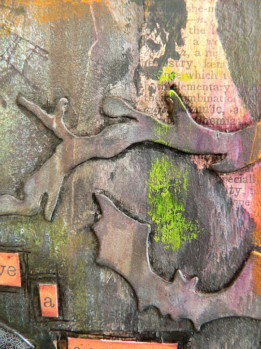


I hope you like it and are having a lot of fun creating for Halloween too!!!


Hugs and happy crafting,
Claudia 
xxx


Wednesday, 2 September 2015

Mail Art

Quite some time ago I created some mail art to send to two lovely friends I had the great luck to find (and make) via crafty blogland.

Only today I found that I had completely forgotten to share them on my own blog. So let's now be the time for some mail art appearance ...

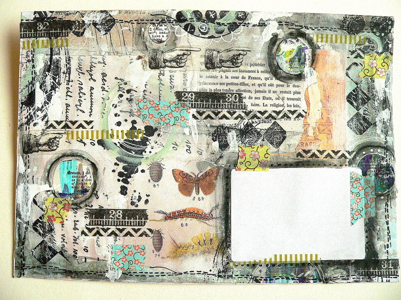
I created two envelopes using mainly scraps from old book pages and loads od different washi tapes alongside some rubber stamping and doodling.


As you can see I got completely lost in the process and covered up each and every tiny single spot (I really had to remind myself to leave some space for the labels...lol).


This guy is a torn colour copy from some flea market find photographs that I collaged onto the blank envelope.


And this is a colour copy of an old book about butterflies from a certain European region. Another find from a flea market.


Stacking and layering washi tape is one of my most favourite techniques as it creates depth as well as texture. You can also see one of my self-made circles I like to use on some of my projects.


I create them by collaging scraps from old book pages or stamping script to a sheet of watercolour paper. Then I apply various fluid acrylic paints (the DecoArt media line works best for this from my point of view) with a palette knife by "scraping" it on and seeing to it that I create a lot of overlaps. Then I randomly cut out circles freehand and store them for later use in one of my little treasure chests.


In this case I glued them on and then drew a rough circle around them with a watercolour pencil, so I could smudge the drawn outline with a fine tip brush that is loaded with water.

I also love to incorporate circles cut from old book pages or designer papers.


And as you can also see I often for a finishing touch scrape on some white Gesso once all my elements have been added. This helps blend them all in and adds additional texture.


I also love to add stamped on stitching patterns with a lot of my projects.

I loved the combination of the black and white and the floral design washi tapes!


And addings some doodling to stamped on images is great fun too!


The fab stamps from Stampendous are just perfect for this! There are quite some who have that brush-stroke like texture to them which I think fits perfectly.


I love the idea that the mailing process adds some uncontrollable visual elements to my creations!

I hope you enjoyed your visit! Thanks for popping by!!!
Writing up this post definitely reminded me of doing more mail art soon! ;)

Hugs and happy crafting,
Claudia x

Tuesday, 18 August 2015

Screw it! Let's do it!

Well, I hope this quote isn't too vulgar (as a non-native speaker you can never be sure even though you know the general meaning of a saying...lol)...but honestly - even if it is - I love the idea behind it as I believe that way too often we tend to think too much about all the possible (but rather unlikely) problems or reasons for not doing something that we totally ignore our personal urge and need to do it.

Sometimes - only sometimes - we are allowed to make ourselves happy in the first place and do whatever we feel we need to do to enjoy ourselves and feel "alive". So at least this is how I would interpret this saying. Please, native speakers, correct me if I am wrong. ;)

But enough of the personal blah blah....this is my Spotlight post for Our Creative Corner and we were given lovely products by our fabulous prize sponsor Tando Creative this month - so here I am to show you only one of the billions of possible projects to create from their stuff.


I had always wanted to try to imitate rust in its most colourful form (=when it meets up with old peeling lacquer) and when I stumbled upon this awesome photograph on pinterest I knew where I wanted to go with this.


image source: I Luv Cameras on flickr


If you want to know how I achieved the look of my two mixed media panels with the fab Tando Creative Screws on, just hop over to Our Creative Corner, where I am sharing a detailed step by step

Hugs and happy crafting,
Claudia xxx 

http://ourcreativecorner6.blogspot.co.at/


http://www.tando-creative.co.uk/trade/

Saturday, 1 August 2015

Mexico Moods - Summer Challenge at Our Creative Corner


Servus and welcome to the second package of inspiration for our special "Mexico Moods" summer challenge over at Our Creative Corner!

And along with a fabulous mood board that is meant to be your inspirational source and guideline for your projects come some more specials like our two fantastic prize sponsors, Stampington&Co and Tando Creative and two wonderful guest designers chosen by the OCC team.
Stampington are also generously offering a $2 voucher to everyone who enters our challenge!

Our Top3 will be a team vote this time instead of having a challenge host who chooses them. 

And this is the wonderful mood board that I fell in love with at first sight:


Grab any inspiration you like from these images - colours, shapes, themes, the whole bundle...

As I loved every single image of the mood board I decided to go for the colours mainly and so I took out my acrylic paints, a palette knife and some coloured canvas tags and started creating a happy mess - trying to mainly capture the vibrancy and joyful mood of the colour combos instead of having a finished project in mind when I started out. 

And this is the series of five vibrant tags I came up with:


 I simply scraped on various paints using a palette knife and saw to it that the tones formed the same colour combos which I so loved and adored with the mood board images. The already coloured background of the tags was very helpful as I didn't have to see that I covered up the whole area. 


I added some scribbling with a white Sharpie, a bit of adhesive fabric ribbon and washi tape and some stamping to add more detail to them. The finishing touch was done with my label maker. 


I had a great time messing with vibrant paints, scribbling, stamping and doodling.... hope you will have a great time when doing your "Mexico Moods" projects too! Can't wait to see them over at our Summer Challenge!

Hugs and happy crafting,
Claudia xxx