Showing posts with label Prima. Show all posts

Tuesday, 20 May 2014

52 Card Pickup - Session 5

It's been quite some time since I have done any altered playing cards for my 52 cards pickup project. If you don't know that "52 Card Pickup" means, learn more about it here.

This time my group of four cards look a bit less "lighthearted" and "fun"...which mainly is caused by the fact that I have been struggling with constant nervousness and sometimes also panic attacks from out of the blue for the last months. And although I still try not to let it take me down too much, I have reached a point where I can feel the exhaustion quite a lot. (The source for this still isn't found yet, but my doctors and I are getting closer it seems...).

You will find that the quotes I used on these four cards indicate some of the struggle I am in at the moment. But then I think: in that hectic life most of us have they should be helpful to others too sometimes.


#17


#18


#19


#20


Materials used:  Paper Artsy Eclectica Fresco Finish Chalk Acrylics "Chutney", "Chartreuse", "Seaweed" and "Tikka" alongside some scraps from the Prima "Cartographer" paper stash. Washi tape, some Bo Bunny, Kaisercraft and Prima stamps for texture and Distress markers "black soot" and "broken china" to shade in the word tiles and hearts.

Hugs,
Claudia x

Sunday, 9 February 2014

A Toilet Roll Steampunk Tag Album - and a DecoArt Tutorial

Hello, servus and welcome back for another tutorial for the DecoArt International Design Team Blog (featuring Andy Skinner) which I am proudly part of!


http://decoart.com/andyskinner/


Browsing the net I recently found some wonderful mini tag albums made from toilet rolls and I felt the urge to finally do one of these myself!

And as some of you might already know Meresanth from "Meresanth Krafts" has recently opened her brand new online store "Retro Kraft Shop" where she offers the most wonderful vintage steampunk crafting goodies.

http://www.retrokraftshop.pl/en/

She generously sent some more of her treasures along with my order so I could have a play with them and create a project for her shop blog - and this is the result:


It was a lot of fun to play with all the watch parts and lovely embellishments, lace ribbon and designer papers! But now on to the promised tutorial:


To make your own mini tag album you will need:


- DecoArt white Acrylic Gesso
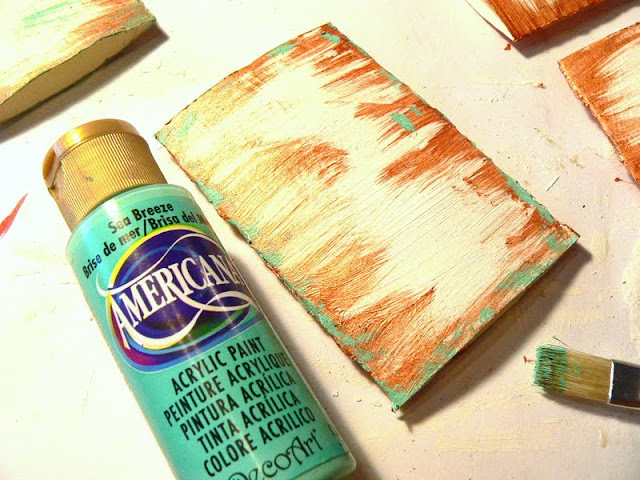
- DecoArt Americana Acrylic colours "Red Iron Oxide" and "Sea Breeze"
- DecoArt Dazzling Metallics "Bronze"
- DecoArt Decou-page matte


- some bristle brushes
- 5 toilet rolls (and your Sizzix or Cuttlebug to get them real flat)
- a tool for making eyelets
- wire and some pliers
- designer papers of your choice
- scissors, glue, eventually some sticky foam pads
- some small tags (or the Sizzix "Tag and  Tie" die, which I used for my tags)
- some stamps and stamping ink for further embellishment
- Distress ink "rusty hinge"
- various kinds of washi tape


Items used for embellishing this project that are also available on Meresanth's Retro Kraft Shop:
- Prima "Printerie" stamp set
- Vintage Neutral - K&Company Paper Pack
- Bronze Metal Branch
- Bronze Metal Key 4
- Watch Dials and other Watch Parts
- White Lace 
  

Step 1

Flatten your toilet rolls using a bone folder or (even better) your Sizzix or Cuttlebug.


Step 2


Give the rolls a thick coat of white DecoArt Gesso.


Step3


Take the DecoArt Dazzling Metallic "Bronze" and paint your rolls once the Gesso has dried.

To do so load your brush with some colour and stipple the colour onto the edge of your roll:


Then use the same brush (or your fingertips) to direct some of the applied colour towards the roll's center with gentle and fast strokes:


See to it that you don't work too evenly. Let Mr. Random be your guide ;)


Step 4 

Next apply some DecoArt Americana "Sea Breeze" - but this time the colour has to be stippled on and around the edges - that way it looks like spots of verdigris patina.


Step 5

Load a brush with some heavily diluted DecoArt Americana "Red Iron Oxide" and sprinkle a lot of stains on your rolls and do this from both sides. This will add a little more depth to the bronze look. 


Step 6

Punch some holes for the eyelets. You can set the eyelets right now but can also add them later.


Step 7

Cut five tags from designer papers using the Sizzix "Tag and Tie" die and your cutting machine. 


Step 8

Choose some designer papers for all sides of your painted rolls and cut them to rectangles that don't cover the eyelets and leave an edge about at least half a finger's width - so your beautifully painted edges remain visible. Leave one of your painted rolls untreated - we will later use it to create the cover.


I also distressed and then blended the edges of my cut to size paper panels with DI "rusty hinge"before I glued them in place.


Step 9

Add some pieces of washi tape here and there. Create layers and overlaps.


Step 10

To make the cover wrap some lace around the "front roll" and glue it in place. Then embellish to your liking. 


I used some watch parts, metal embellishments and some stamping on the cover. But you can do whatever you are up to.

Step 11

Cut two pieces of wire to size (depending on how many pages your album shall have). (leave a bit more on both ends to form two tiny rings at each end - but for now leave the ends straight so you can insert them through the eyelets). 
Bend your two wire pieces into circles by "wrapping" them around one of the DecoArt colour bottles' caps. They have the perfect diameter for book rings ;). Assemble the album before you finish the wire ends!


Step 12

Assemble your mini album once you have embellished all the pages. 
Insert your cut out tags. 
Curl up the wire ends at least once (see picture above) to close the rings. Then use pliers to form small rings at all ends, so no one gets hurt by any sharp and pointy wire ends. 

Done!


On the inside of my album I used some of my newly "found relatives" from my last visit at the flea market at the famous Vienna Naschmarkt. I made colour copies and blended the edges with DI "rusty hinge".


I hope you can see at least a bit of the shine of the DecoArt Dazzling Metallic "Bronze" - as it looks so very cool!


I love the colour contrast of the "verdigris" and the shiny bronze! It is what keeps the album's design together.


I had to fix the spring to the cover with a brad. All the other embellishments were glued on using DecoArt Decou-page matte and/or sticky foam pads.


The tiny metal branch was fixed to the clock face using a small piece of thin wire.


And don't these calendar rings look just great? The bell jar image is a stamp from the Prima "Printerie" stamp set (as are the stamped words and the "Welcome" at the back cover).


I hope you will be making your own toilet roll steampunk albums soon! Thank you ever so much for stopping by and the encouraging comments! (Ssssst...he's my personal favourite: ;)


Hugs and happy crafting,
Claudia x

Saturday, 1 February 2014

Just Three Colours - Our Creative Corner's February Challenge

Servus and welcome back, dear crafting friends and followers old and especially anew!

Time to introduce to you Jenny's (aka Button) challenge over at Our Creative Corner! This month we want you to go for:


"Just Three Colours - use only shades of blue, brown and plum/purple on your project; no black lines accepted!"


This means that not even black lines from stamped or digital stamped images are allowed with your makes. 
I really loved her idea of banning black lines - it makes us look differently at the use of our stamps and ink pads and opens new ways for new designs. Which always is a good thing! 


Actually the brown paper I stamped on changed the stamped on colours ("gathered twigs", "rich cocoa" and "dusty concord") into a darker tone than I had expected - so some of them look rather dark brown- or purpl-ish...which looks a lot "richer in tone" than a black line ever could. So honestly I really like this happy accident ;)

I tried two tags on which I only used Distress inks "broken china", "dusty concord", "chipped sapphire", "vintage photo" (for blending the portraits) and "gathered twigs". 

Using four of these for the wrinkle free distress technique on a piece of white card for creating the background, some of the lighter blues and browns mixed into a shade of turquoise...which I had not thought about but was obvious to happen - and which I really liked... ;)

As most of it was going to be covered up by a lot of layers I decided to use my tag anyway even though turquoise definitely is not just a shade of blue... ;)


I finally was able to get the awesome "Dr. Coffin's Apothecary" stamp sheet from Oxford Impressions with a German stamps shop last autumn and the browns reminded me of old labels...so I decided to make apothecary themed tags. 


 On the first tag I accidentally found that the Ranger embossing powder "brown puffs" is exactly the same colour as the kraft paper I used it on - which makes it look even more like real embossing...wow!


  I played around with the gorgeous sewing stamps from Prima and heat embossing with Ranger "rust" and "brown puffs" embossing powders. 


Most of the edges of the stamped and cut out images were distressed. Some of the papers I stamped on were first blended with some blue or purple shades of Distress ink and sprinkled with some droplets of water, to give a more aged look to them. 


Making two tags at the same time gave me the opportunity to try (and compare) variations of the same technique or colour effect. I guess I will be doing this more often from now on! 


For the two portraits of imaginative "Arthur Coffin" or "Monsieur Routen" I made a copy of two photographs of some of my ancestors. They fit perfectly, don't you think? 


At least they could be doctors as they look very earnest, don't they? 
But most people in old photographs do...maybe because they had to sit still for a couple of minutes to get sharp images....maybe because having a photograph done was a much more important and honouralbe matter in those days than it is now... I often wonder why my ancestors - even the children - looked so dignified when they had their photographs taken...and how it might have been living in their times... with a lot of technical things working much more slowly (or not even invented then). 


 Have you already heard that there's a prize to win each month now at Our Creative Corner?


 All you have to do is enter our challenge with a make that follows all the challenge criteria and our general rules... maybe you will make our winner, Top3 or even the prize win?! Join in and use blues, browns and purple/plum only!


This month our generous prize sponsor is Nicecrane Designs! 

http://nicecranedesigns.com/


See you there!


Hugs and happy crafting,

Claudia xx