Friday, 2 August 2013

Time Traveler - an "all Tim Holtz" multi-fold tag ;)

Frilly and Funkie have a great challenge at the moment - "Any way you fold it"! The DT came up with awesome pieces and they really inspired me to give this one a try! (Thank you, ladies ;)

I played around a little with the possibilities of a multi-fold tag and finally came up with a template I really liked. Using it I created this multi-fold tag:
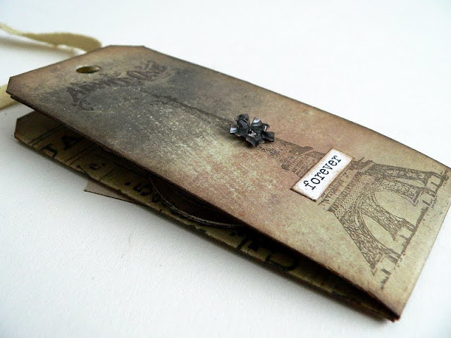


But before I show you the insides,  here's the template:


I used a wonderful calendar sheet from one of my Tim Holtz paper stashes and the Sizzix Alterations Tim Holtz "Tag & Tie" die for this. But for my first try for a template I took an upright DIN A4 size sheet of white card and drew a horizontal line at the middle of it using my set square . Then I marked the three widths of the middle and the side tags. The one in the middle measures 5,5 mm, the two to the sides 5,3 mm.

Then I drew four verticals at these marks, paying attention to maintain perfect right angles. Afterwards I sketched in the hights of the upper and lower tag sections, which measure 12 cm. I cut this to size (having a rectangle with one horizontal and two vertical lines in it). Then I creased all the folds using a folding tool - first to one side and then to the other. The left wing was folded to the back of the center panel and the right to the front as a cover. Finally I folded the lower section upwards so it was on top.

I put this paper sandwhich onto the sizzix die, paying attention that it was centered and that only the upper section of the tag would be cut (all the rest of the folded paper should be "inside" the tag's cutting shape (therefore we made it some mm smaller than the actual size of the tag)).

Only after I was sure that this template really worked, I drew it once again - this time onto my Tim Holtz paper - and "sizzix-ed" it.

Voila:


Then I cut off a part of the lower left tag section, leaving a lid to build a pocket with by glueing it to the upper tag section later (after inking all the edges).

I folded my tag again the way I could insert just the lower right section into my sizzix and die cut a border (I used the Tim Holtz On The Edge die "Iron Fence"). This piece was meant to form a pocket later.

Next I blended all the edges with DI "gathered twigs". Then I glued the two pockets.


The vertical pocket lid was stamped with my favourite pointing hand image to add more interest. I stamped one of the great gentlemen onto a TH journaling ticket and blended the edges too. Then I inserted it into the pocket (and glued it in place).

This is how the tag unfolds once you pull off the ribbon:


The cover (well, actually the whole tag) was stamped with TH stamps and embellished with idea-ology  and chit chat stickers.


When you fold the cover down, you reveal the back of the right tag:
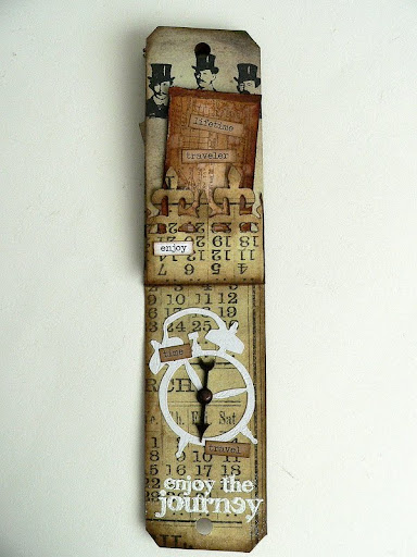

Here you can see the pocket made from the lower tag panel, which now holds another ticket.


As my multi-fold tag is all about life, lifetime travel and time travel (which sometimes can all feel the same ;), I chose clocks, compasses and theme related chit chat stickers for the designs of the single tags.


All folded out, the inner/front side of the tag looks like this:


The compass and the key were die cut from grunge paper using the TH "mini pocket watch and key" dies. The compass was painted using Distress stains "tarnished brass", stamped and heat embossed with black embossing powder. For the key I used Fran-tage "aged copper" embossing enamel.

The alarm clock shape was a gift from dear Rosie. Thank you, Rosie!

The rotating clock hand is fixed with the same brad that also holds the metal flower in place on the other side of this tag.

For a finish I added some chit chat stickers and fixed the "pocket compass" to the middle tag with a silver chain, that I had toned down with alcohol inks first.


I overcooked the key during the heat embossing process, which gave it a really worn look:


Done!

This is how the tag looks seen from the other side:


I hope you like it (and I also hope that I explained the how-to rather understandable...but if not, you will surely find out on your own by folding until you have the single tags where you want them to have in and in what order you want them to have...the possibilities are almost endless (well, hubby, who is a mathematician would tell you that there are exactly 6x4x2 ways to fold your tag ...yes, I asked him even though "almost endless" always works well for me *lol). Really important is, that you have exact right angles and your folded paper is smaller than the die's measurements, so you only cut the shape of the tag's top.

Thanks for stopping by and have fun!

Hugs,
die amelie x

Steampunk Notes and a swap!

I had the great pleasure to do a swap with awesomely talented Candy Colwell lately and today is the day we both chose for showing to you what we swapped with each other.

 As you may well remember - if you have already visited my blog yesterday - she is our fabulous guest designer this month at SanDee&amelie's Steampunk Challenges! Yay!

All those who haven't already seen what she made for our August challenge "Matchbox Steampunk" - hop over to our challenge blog or to her blog to see the absolutely fantastic make of hers!!!

 She also created an awesome project for me! A truly terrific Steampunk note book!!!


It's soooo fantastafabuliciously great, isn't it? :)
The inside comes with beautiful papers and an envelope to store some tiny notes in too!!! I LOVE that! 


Loads of yummy texture and detail on the outside:


And the magnifying glass with the awesome portait of a gentleman wearing a top hat is the perfect eye-catcher! Yippeeh! And it's all MINE! *lol


But not enough - Candy also sent some wonderful goodies along with her fabulous note book:


Loads of great ephemera, ribbons, buttons and paper treasures AND also some fab metal embellishments. WOW!


It felt like Christmas (maybe even better!) when I unwrapped all the treasures she had sent me! What a terrific parcel to receive!! Thank you so much, Candy!!! (I already used some of the goodies you sent me *giggle...but I as I did use them on a DT project I cannot show you before 1st of September (yes, I am a well prepared crafting girl *lol).

I also had sent her an altered steampunk note book (but only about half the size of hers *lol). I really wanted to make something very special for her and when she told me that she liked it, I was very happy!  (I am still so very proud and happy that she wanted to do this swap with me as I am a great admirer of all of her work ;).


It took me some days to figure out what I wanted to create for our swap, but when I stumbled upon a little notebook (a free gift from my favourite "Schloss-Hotel", Burg Bernstein) and a folding yardstick from the 1Euro store, the project started to take shape in my imagination finally....


I cut the folding yardstick (with old large scissors) to pieces, alcohol inked them and  sanded them down afterwards for later use.

Then I covered the booklet with some papers from my Tim Holtz stash on the in- and outsides, leaving the paper with the inside of the booklet's back cover a little wider than the actual size of the cover so I could glue one of the yardstick pieces to it.

The edges of the front and back covers were distressed using a carpet knife. After that I blended the edges with DI "gathered twigs" and "rusty hinge".


  For the two "inventors" images behind the screens
on the front and back covers I first gessoed a page from an old book, then stamped the three inventors from the Artistic Outpost "French Flight" sheet onto it using Memento archival ink "rich cocoa" and tore them to three pieces, blending the edges with DI "gathered twigs" (one of my new favourites from the DI range).


I cut two screens from acetate (mostly packaging material from my Sizzix dies) and treated them with various alcohol inks. After they had dried I sanded the edges with a sanding tool and scratched the surface with the Tim Holtz "retractable scratching tool".


I mounted them together with the stamped images and some layers of heavily distressed ribbons to the booklet using brads and glue.


Both parts of the metal latch were glued to the cover and the yardstick using strong crafting glue made especially for use with wood, metal or plastic.


The gear and the yardstick piece on the front cover were also glued in place after
stamping and heat embossing the Paper Artsy "gears" image using Ranger "rust" embossing enamel and the heat tool.

The "notes" sticker is one of the Tim Holtz idea-ology chit chat stickers, blended with DI "rusty hinge" before adhering it to the cover.

I love the closing mechanism! I had been storing this one for a very long time and was so happy that it finally found its perfect "home" :)


For a finish I added some self adhesive ribbon on the back, covering the overlapping piece on the back of the paper where I glued the yardstick on. I added a tiny piece of a dictionary page for further embellishment and gave the edges of the pages a coating with copper rub on and  - done!


I hope you like it (and of course that Candy does as well ;)! I really enjoyed creating this booklet and using some of the stuff I love so much! Thank you for stopping by and staying with me this far. As usual I have added some more close-ups for you and hope you enjoy them as you enjoyed your visit here!

Hugs,

die amelie x


I enter this project into SimonSaysStamp's Wednesday Challenges "Anything Goes" and Fashionalbe Stamping Challenges' "Script/Book/Pages/Print" challenges

Thursday, 1 August 2013

"The Sea" - OCC's "Words" Challenge for August

Hello, dear readers, crafting friends and followers! 
I welcome you back to

"Words!"

Two days ago I already invited you over to TIOT's "Collage with a twist"-challenge and today this is also the second invitation to a challenge, as I have posted about SanDee&amelie's Steampunk August-challenge earlier in the morning. So there should be plenty of inspiration for you to choose from ;)

But back to OurCreativeCorner and "Words!":

We would love to see projects with words at the heart of them - whether that means they include a quote, a sentiment, a song lyric or some words from inside your own heart and mind; or perhaps the project includes text of some kind, typed or script, handwritten or printed, as a major element; or maybe you can find some other way to have words at the centre of your creation.

My teamies have of course again prepared a lot of beautiful inspirational pieces for you and this was the perfect occasion for me to create a board that is meant as both - a memory keeper of a wonderful holiday on Paradise Island in the Caribbean AND a tribute to one of my favourite summer holiday songs - "The Sea" from Morcheeba.


 I had these lovely small shells and corals I had collected on my long early morning walks on the long (and still empty) beach, which I have been wanting to display for quite some time now - and this was the perfect occasion.

I created a background from corrugated card, which I coloured with Distress stains "tumbled glass" and "salty ocean" together with Dylusions ink spray "White Linen". I tore off some of the outer layers of the card, which left some "holes" and I also cut the piece to size while the colours were still wet - so this rather tore the edges than cutting it (I LOVE that effect ;).

After I had dried it, I heat embossed some of the edges and raised areas with white embossing powder.


I also added some Distress stain "brushed corduroy" using a brush to add more contrast and depth.


The shells were stamped onto white card and covered with DecoArt gloss "Decou-page" to build a resist, as I coloured the white card afterwards using the wrinkle-free distress technique and a lot of Distress stains. I also distressed the edges, blended in some DI "broken china" and flicked some drops of water onto the cut to size pieces of the stamped on card.

The refrain of the song was stamped onto beige card using HeroArts letter stamps and archival ink "Royal blue".

The corals and shells were fixed to the board using thin silver wire.

The most fun was making the two focal words - "sea" and "free".

I die cut them from light blue card using a Tim Holtz Alterations Alphabet die and gave them three layers of UTEE afterwards.

I paid attention that the last layer wasn't totally melted down - so some of the crystals are still visilbe and give it a sandy, sparkly touch - like beach sand when it gets wet.


The four plates with the stamped on shells were mounted to the board alongside some rough white ribbon for more texture.


I fixed some white rough burlap to the top and the bottom of my board for a finish. Done!


I hope the feeling of a beach holiday becomes somehow visible for you too ;)
Thank you for stopping by my blog and having a look around! I would love to see your entries with our "Words" challenge soon!


With this project I join the challenges over at Inkspirational - "Anything Goes"Pollycraft Challenges - "Fun in the Sun", City Crafter Challenges - "Summer Time" , The Artistic Stamper - "Postcard, Travel and Holidays" , SimonSaysStamp - "Ode to Sunshine" (as it is the sun that bleaches the shells, driftwood and corals and I always feel the warmth of the Caribbean sun when looking at that board), Order of the Opus Gluei - "Don't be such a Beach"The Squirrel and the Fox - "Nautical/Sea Life" and Creative Craft Challenges colour challenge "Blue and Brown".
Hugs,

die amelie - Claudia xx

Matchbox Steampunk - August challenge "chez SanDee&amelie's"

Welcome back for another appetizer for the new challenge over at SanDee&amelie's Steampunk Challenges :)


This month we want you to 
use one or more matchboxes with your projects. 
As always our challenge is "anything goes"
as long as it is Steampunk 
and our monthly theme is incorporated. 

Of course this month we have a wonderful guest designer (with a lot of contageous creativity going on ;) with us again and a prize to give away for this month's randomly drawn prize winner. ;)


I had rolled this theme in my head for quite a long time - having no idea even though it was me who suggested the matchbox challenge... but after I had a long play with some white matchboxes, combining them in multiple ways, stacking them, building a row and whatever you can do with three matchboxes, I came up with a creation that I would call "cubist", as it reminds me of a lot of cubist sculptures that all have in common that the artist had a play with cubes, trying to arrange them to a shape and form that might draw the viewers interest to it ;)

So here comes my "Steampunk Cubism" *giggle:


It also reminds me of geometry drawing one learns at school ;)

I first covered a piece of crumpled and then again unfolded brown paper with random brushes of white DecoArt Gesso and after that had dried I stamped some Kaisercraft "dicitionary meanings" and IndigoBlu adverts on it with black archival ink. I covered the matchboxes with this paper, cutting off the excess afterwards.

The compartments of the matchboxes were sprayed with GlimmerMist first and then covered with a filmstrip washi tape on the outsides (which also helped to stabilize them).

Then I gave the edges of the boxes a shading with Distress ink "walnut stain" and glued the three boxes together. I also added some torn scraps of the brown stamped paper for more interest:


For the insides of the compartments I stamped three Steampunk images (from Oxford Impressions and Artistic Outpost) onto more gessoed brown paper, cut three pieces to size and glued them to the boxes' bottoms.


Next I stamped the "cube steam punk" onto white card using my HeroArts letter stamps and jet black and sepia archival inks. I cut the letters out separately and glued them to three different areas of my "sculpture". Afterwards I drew a black border around each letter for more depth.


Having all my paper work done I went on with embellishing. I created a handle for one of the compartments using thin black wire.


The second "drawer" got a metal tab on it showing my lucky number: 7.


To this matchbox I fixed a Tim Holtz idea-ology light bulb using wire again. The wire also holds the gear in place.

To the top of the third compartment I glued a Prima butterfly nut that I gave some dabs with alcohol ink "terra cotta", with which I also coloured the bulbs' sockets.


The bottlecap (one of my on-my-balcony-rusted ;) was embellished with a plastic button I coloured in black and gave some metallic rub ons from DecoArt afterwards. I also glued a rusty screw to the side of the "cube" matchbox.


The upright matchbox compartment was glued to the box to stay in place. The other two compartments can be closed and opened (to hide or reveal their "treasures").
I had a lot of fun embellishing my tiny sculpture with Prima-, selfmade- and Tim Holtz idea-ology goodness and I hope you like the outcome too :)


Please, hop over to our challenge blog to see what my dear friend and Steampunk soulmate SanDee1899 and our special guest Candy Colwell (YESSS, THE Candy Colwell ;) have prepared for your inspiration! I thank you for staying with me this far (as it was a quite picture heavy post again), wish you a happy crafting time and look forward to seeing your matchbox creations soon entered with our challenge at SanDee&amelie's Steampunk challenges. You always enter such a lot of creative awesome stuff - I can hardly wait to see what you come up with next!


I join the challenges over at SimonSaysStamp - "Anything Goes", Fashionalbe Stamping Challenges - "Script/Books/Pages/Print" , Divas by Design - "Favourite Color Combo" (I LOVE black and white combined with browns!), Out of a Hat Creations - "Numbers" (my lucky number 7 appears two times on my project) and Lady Anne's Challenges - "Monochrome" with this project.


Hugs,

die amelie x